From Arrays to Graph: Different Ways to Represent Image Data in Remote Sensing
Introduction
In the geospatial and remote sensing world, image files are typically referred to as raster files. These files store images in pixels, where each pixel is located at a specific row and column position and stores a single value representing intensity or reflectance. This structure resembles a 2D matrix or array. If each pixel is associated with multiple values (like in multispectral or hyperspectral data) they are stored across different bands, which are essentially multiple aligned layers, each representing one variable.
These raster files are always accompanied by metadata, which includes the coordinate system, pixel resolution, and the coordinates of a reference point in the image (typically the top-left corner). With this information, we can geolocate each pixel. Raster data is typically stored in .tif files, and when geospatial metadata is included, the file is referred to as a GeoTIFF. This format is widely supported and convenient for storing remote sensing data.
More modern formats like Cloud Optimized GeoTIFFs (COGs) allow for efficient workflows in cloud-based environments, which is crucial considering the rapidly increasing volume of satellite imagery. Still, at their core, these files follow the same basic structure: an array of pixel values.
As users of the data, we have the freedom to represent and structure it in different ways, depending on the needs of our analysis. Alternative representations can open up new ways of thinking about image analysis and allow us to apply analytical methods that may not work well with standard raster formats. In this post, we’ll discuss different ways to think about and structure our image data, and how these representations support different types of analysis.
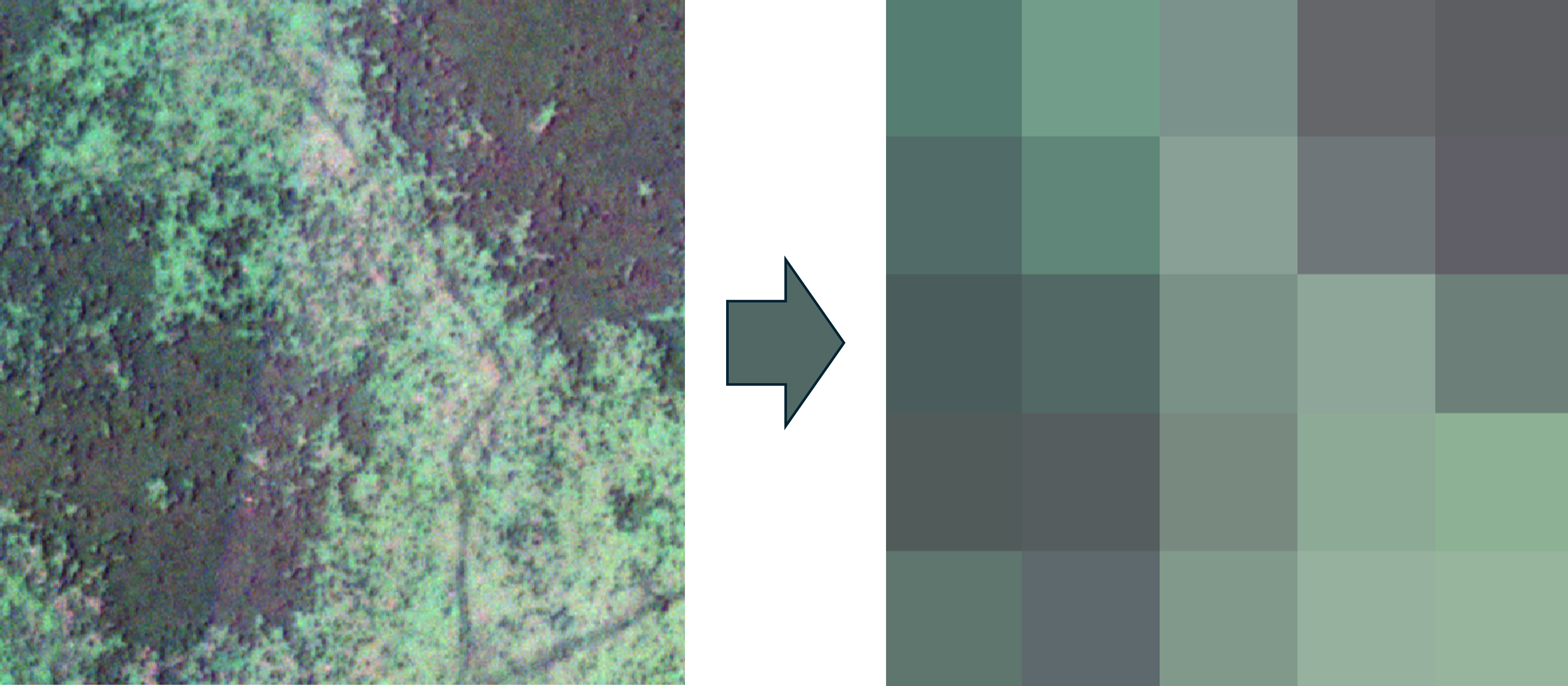
For this example, we’ll use a small image patch with three bands to simplify the visualizations. We downsample this small patch of forest and grassland into a 5×5 pixel image, so the total shape is 5×5×3.
1. Data Cube
The most natural way to represent multiband image data is probably as an array. Our previous image can be visualized as a 5×5×1 array like this:
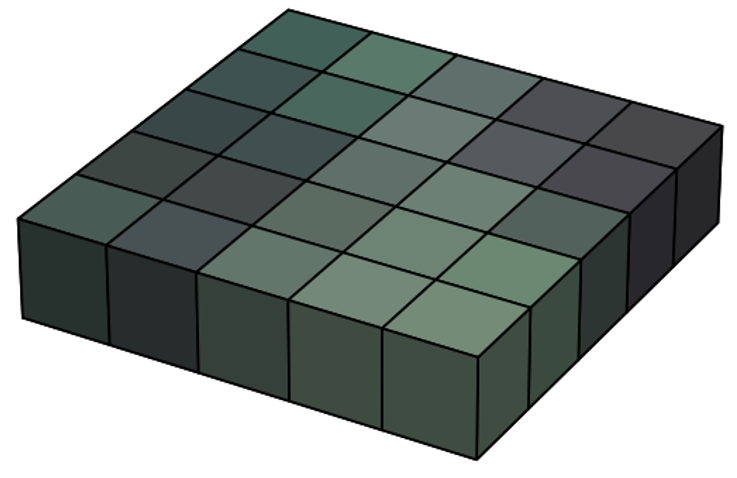
In this case, the displayed pixel values, which shown as colors, are not the original data but a composite of the RGB bands. Behind the scenes, the raw data is a stack of three 5×5 grids, where each layer represents the intensity of red, green, and blue light respectively. Since human eyes perceive light in these wavelengths, we see a combination of them as color. This RGB composite is helpful for visualization, as it compresses information in a way we can easily interpret. However, this compression also leads to some information loss. That’s why, for image analysis, we usually work with the raw, uncompressed form.
In raw form, the image is a 5×5×3 array. For the computer, this is just a structured sequence of numbers. But it helps us to imagine it as a cube, where the horizontal plane represents the x and y coordinates, and the vertical axis represents the intensity in each spectral band (in this case, red, green, and blue).
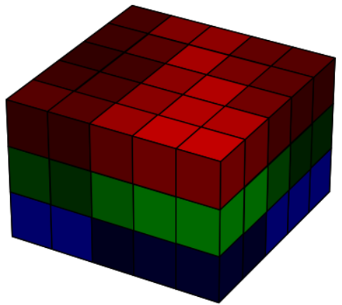
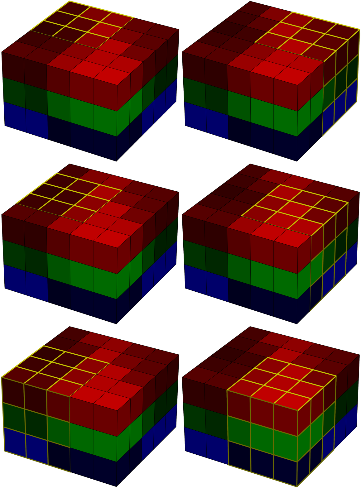
This 3D structure is often referred to as a tensor. Representing data in this way is useful if we want to apply linear algebra or use models that rely on spatial and spectral structure. For example, in deep learning, convolutional neural networks (CNNs) apply a series of convolution operations (visualized as yellow-lined voxels in the image 4) to extract spatial and spectral features from the image. These filters slide over the image with the goal of capturing shapes, textures, and color combinations that define particular classes or objects.
This approach is very powerful and currently forms the state of the art in image analysis. However, it comes with limitations, especially the need for large labeled datasets and substantial computational power.
2. Spatially Flattened Matrix
Some machine learning algorithms like SVM, Random Forest, and XGBoost do not take spatial patterns into account. They treat each pixel independently and classify them based only on their spectral signatures.
If we’re using such methods, or any approach that works on a pixel-by-pixel basis, then maintaining the spatial relationship between pixels is unnecessary. Instead, we can restructure the image as a 2D array, where each column represents an individual pixel, and each row represents a spectral band.
The computer will interpret this as just another structured collection of numbers, though with a simpler 2D format.
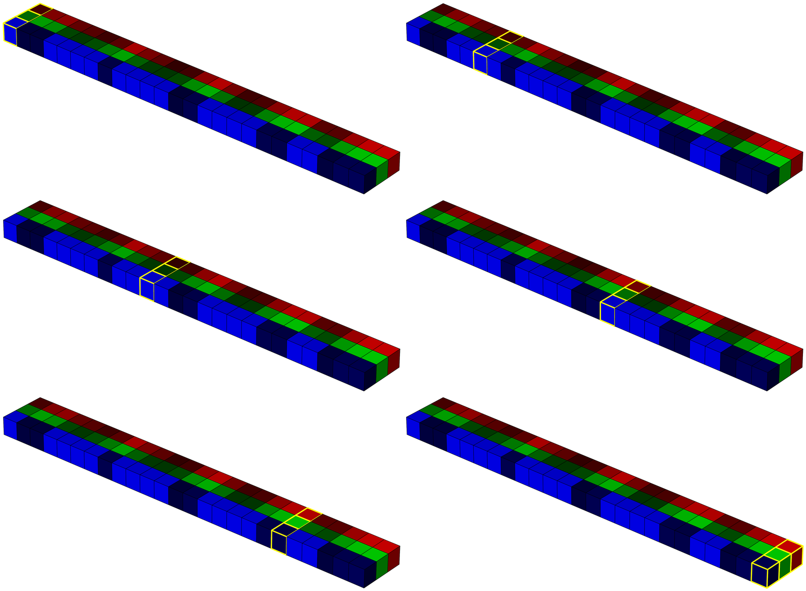
This representation allows the classifier to treat each column as a feature vector, and move from one pixel to another without worrying about their positions. It’s efficient and works well when spatial context isn’t critical.
3. Collection of Vectors in Feature Space
In the previous example, we already treated each pixel as a vector, but we still thought of it mainly as numerical data. In this section, we look at how visualizing each pixel as a geometric object can be useful.
Using the same image, we now represent each pixel as a vector from origin in RGB space.
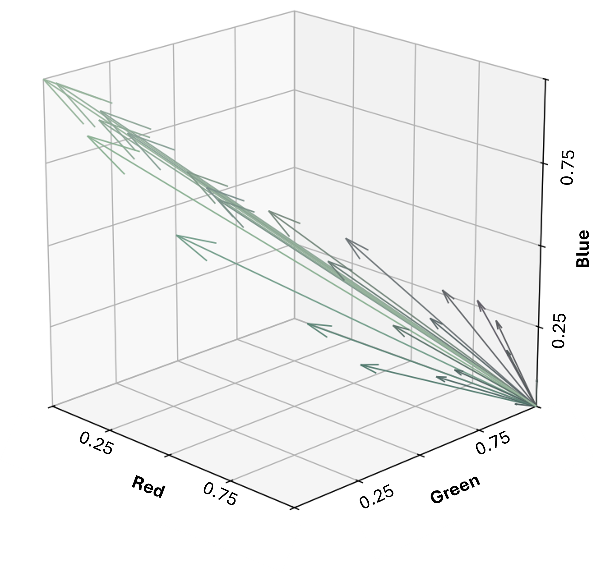
This allows us to evaluate similarity between pixels based on the angle between vectors, also known as angular distance (i’ve discussed this in more detail before here). Pixels with the same color but different brightness will have the same direction (0° angular distance), and only differ in magnitude. This is particularly useful in remote sensing, where terrain and illumination changes can cause variations in brightness. Using the Spectral Angle Mapper (SAM) method, these brightness differences can be ignored.
This geometric interpretation of pixel vectors is also useful for other analytical methods like K-means clustering and Principle Component Analysis (PCA), both of which are based on geometry analysis of pixels in feature space.
4. Graphs
Another way to represent an image is as a graph. A graph consists of nodes and edges. Each node represents a pixel and stores its spectral information. Edges represent connections between pixels, and each edge has a weight that reflects the similarity between the connected pixels.
We have flexibility in how we define these graphs. In this example, I use the pixel’s spatial coordinates for node positions. Each node connects to its 8 neighbors (horizontal, vertical, and diagonal), and the edge weight is calculated based on both spatial distance and spectral similarity (i.e. pixel that is closer to each other and have similar color/spectra have the lowest weight)
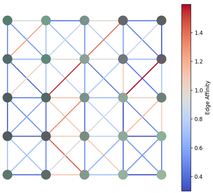
Even with this simple setup, we can already capture the spatial and spectral structure of the image. For example, superpixel clustering can be done by cutting edges based on weight thresholds. More complex methods like graph-based deep learning also become possible with this structure.
In remote sensing, Object-Based Image Analysis (OBIA) is often used for tasks like land cover classification. OBIA captures both spatial and spectral patterns and is widely used because it’s less demanding than deep learning but still effective. Typically, clustering algorithms like SNIC are used first, followed by supervised classification methods like Random Forest or SVM applied to each cluster.
I think OBIA could be more naturally implemented using a graph-based approach, where clustering and classification happen simultaneously in a unified framework. However, I haven’t explored this idea in depth myself.
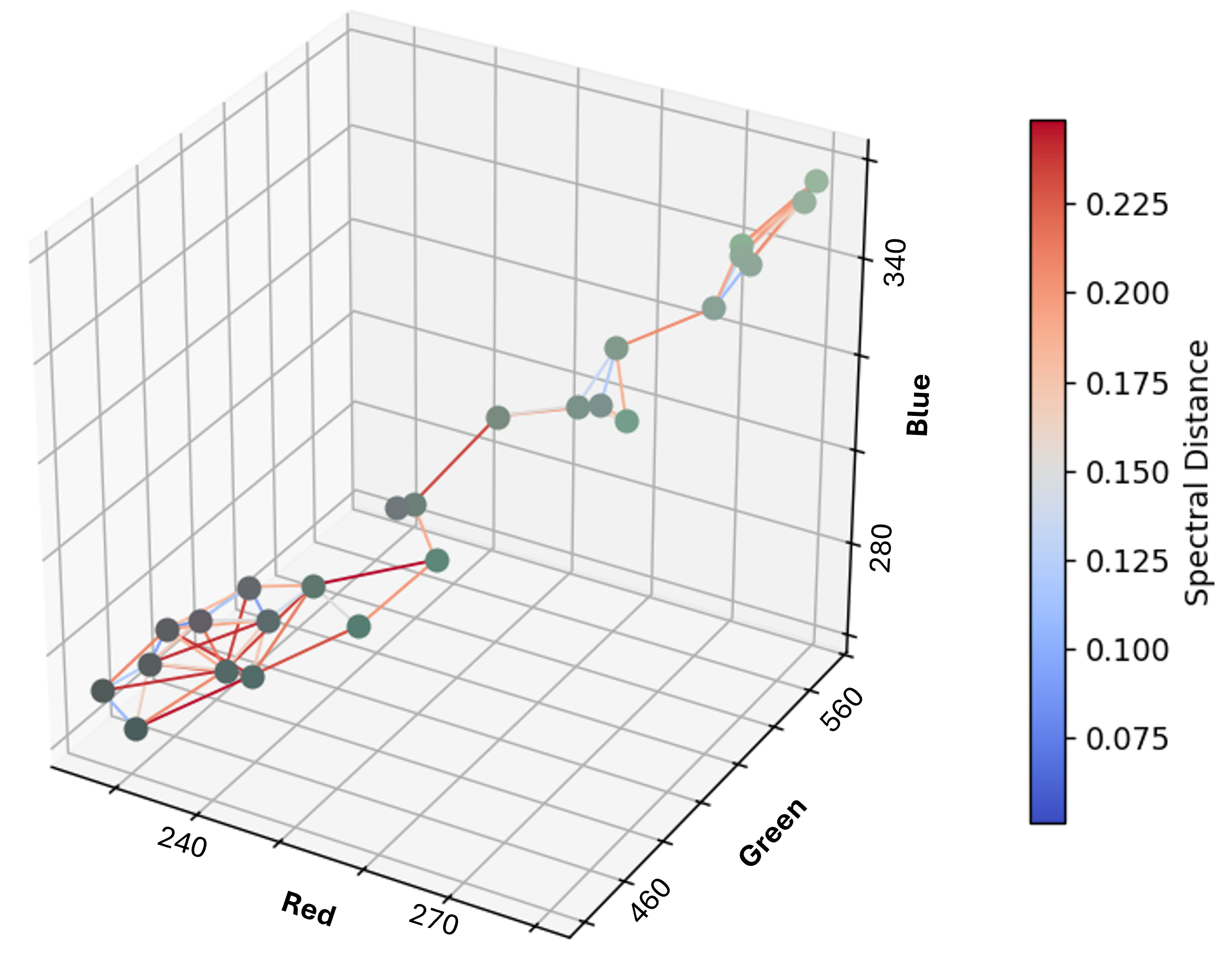
We can also define the graph purely in feature space, where nodes are pixels and edge weights are the Euclidean distance between spectral vectors. This structure makes it easy to apply unsupervised classification methods that group pixels based on spectral similarity, much like K-means.
Takeaways
The way we represent image data can influence how we think about and analyze it. Whether we treat the image as a cube, a flat table, a set of vectors, or a graph, each perspective opens different possibilities and supports different types of methods. In practice, we often move between these representations depending on the task. Some problems require spatial context, some don’t, and some benefit from looking at geometry in feature space.
In this post, I simplified the image to just a few pixels and three bands so we can still visualize and reason about it in 3D space. In real-world remote sensing, however, we often work with millions of pixels and possibly hundreds of spectral bands, making direct visualization impossible. That’s why it’s helpful to build an intuitive understanding using simple 3D examples first. Once we grasp the core ideas in a space we can see, it becomes much easier to generalize those concepts mathematically to higher-dimensional data where we rely entirely on abstract reasoning and computation.
Personally, I find that understanding the data representation used in each analytical method helps us think more clearly about how the method works, and also gives us the ability to adjust our analysis according to our needs. Instead of just following a fixed workflow, we can be more intentional in how we prepare and structure our data. This flexibility becomes especially important as we deal with more complex remote sensing problems, where no single representation fits all use cases.
Enjoy Reading This Article?
Here are some more articles you might like to read next: