Exploratory Data Analysis (EDA) for Hyperspectral Imagery
One of the main characteristics of hyperspectral imagery is its high-dimensional data (i.e., a high number of spectral bands). This type of data, while providing a higher level of detail in the spectral characteristics of the material we observe, also raises challenges in handling the data effectively. Higher dimensional data means it becomes more challenging to extract meaningful information for analysis. These challenges are often referred to as the curse of dimensionality.
In this post, I will show my approach in conducting exploratory data analysis (EDA) on a hyperspectral imagery with the goal of deriving meaningful geological information from the data. In this post, we will assume no geological prior knowledge of the region (although nowadays that is hardly the case, especially for Earth’s surface). We will rely solely on the hyperspectral data itself and some basic spectrometry and geology knowledge.
We will use an airborne hyperspectral image covering the shortwave infrared range (SWIR) from ~2000 nm to ~2400 nm over an area of about 10 km² in an arid region. All of the analysis performed in this post is done using standard scientific libraries in the Python environment and an open-source software called Hyppy developed at the University of Twente.
1. Basic visualization
The obvious first step in EDA of hyperspectral imagery is to visualize the image. We can choose to visualize the image in grayscale for selected wavelength bands of interest and create false color composites to observe the main structural characteristics of the region.
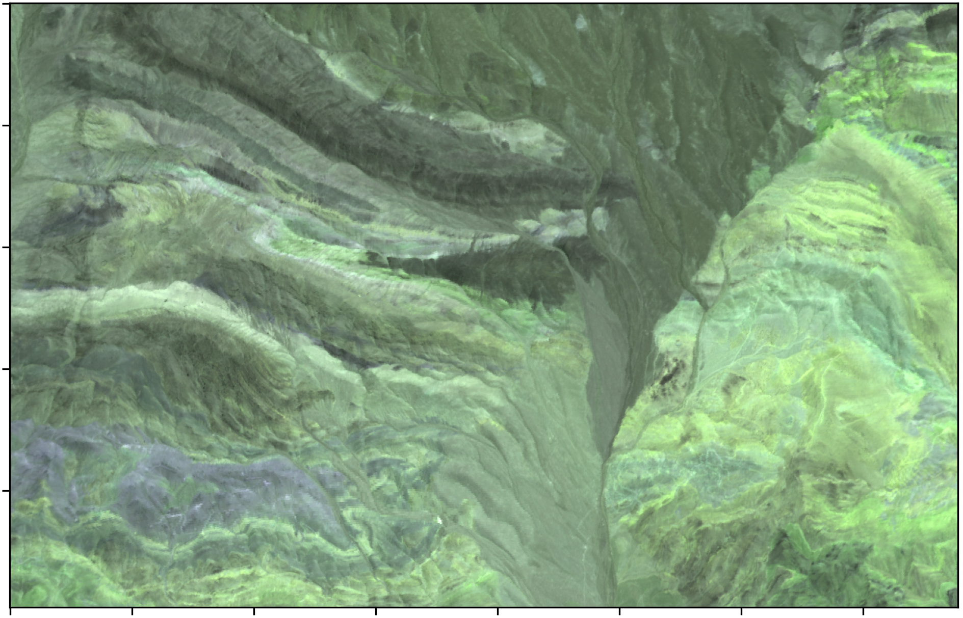
My initial interpretation of the region is that it is most likely mainly composed of sedimentary bedding influenced by a fault with apparent left-lateral movement, based on the drag fold formed along the fault lines.
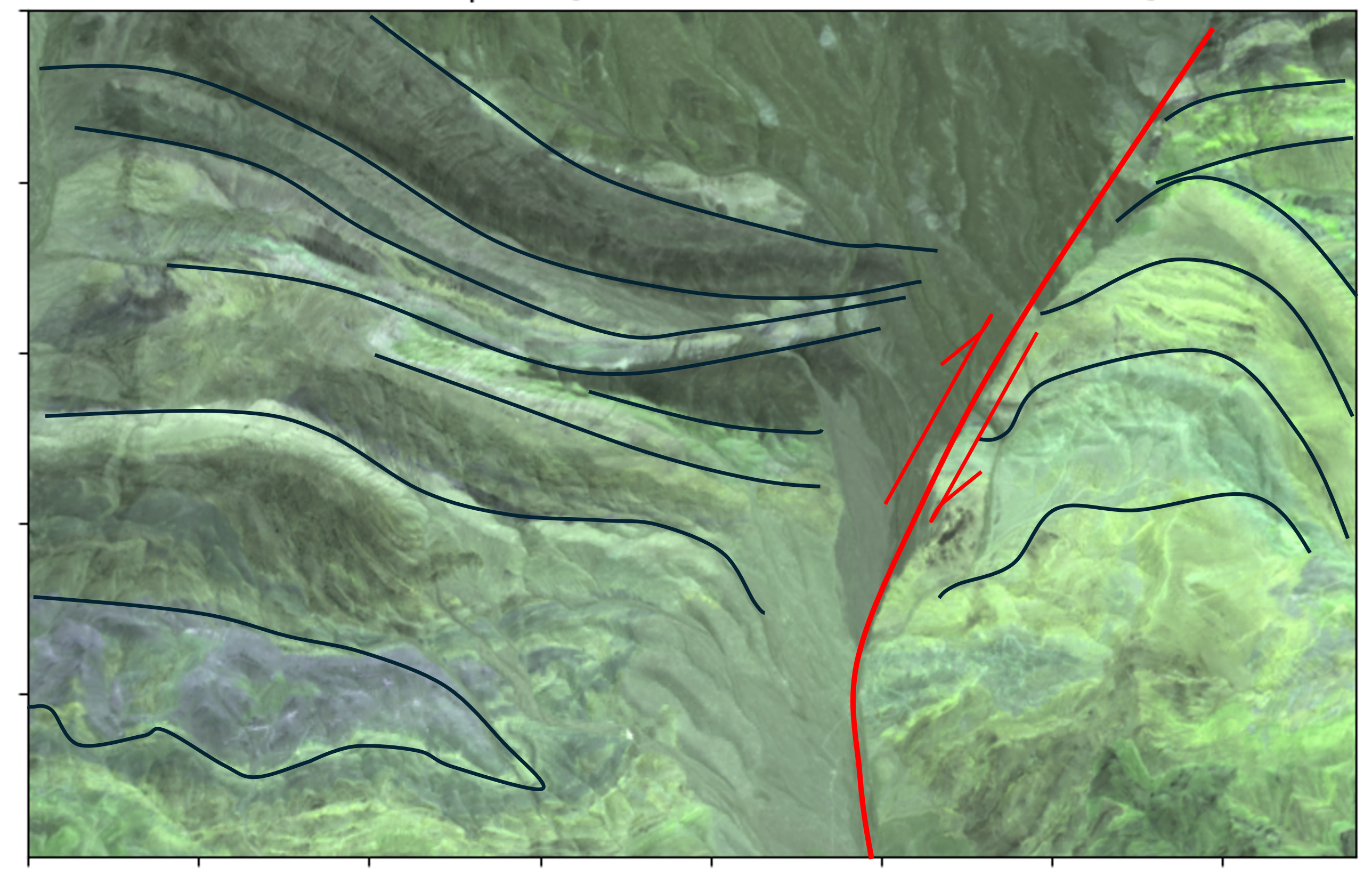
When it comes to mineralogical/geological interpretations, I find it helpful to begin with a very broad interpretation. Knowing that the region is likely predominantly composed of sedimentary rocks already provides significant constraints for further interpretation, which may be very useful in the next phase. We may revisit this interpretation later if further analysis or data does not support it.
2. Getting to know the data
It is very important to familiarize ourselves with the data we are working with. At this stage, I typically inspect the spectra of some pixels that stand out in the visualization and get a sense of the variation in spectral responses present in the image. For this, I often use specialized software such as ENVI, QGIS with Spectral Profile Plugin, or Hyppy. The later two is an open source program which are available for free.
At this stage, we can also plot a histogram of the mean reflectance values of the image to see how many visible clusters are present across the spectral bands. Note that the reflectance value are in the sacale of 10,000.
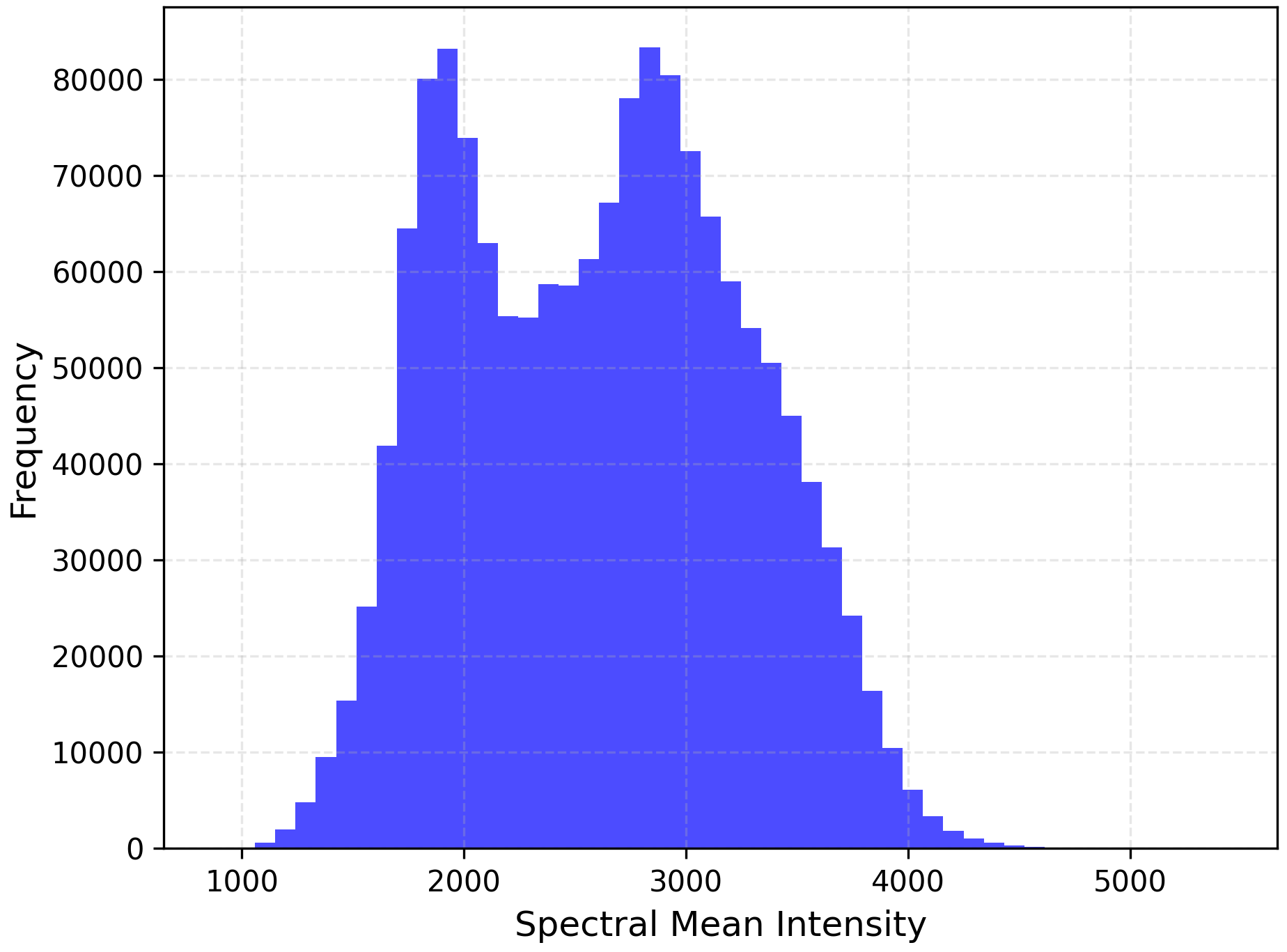
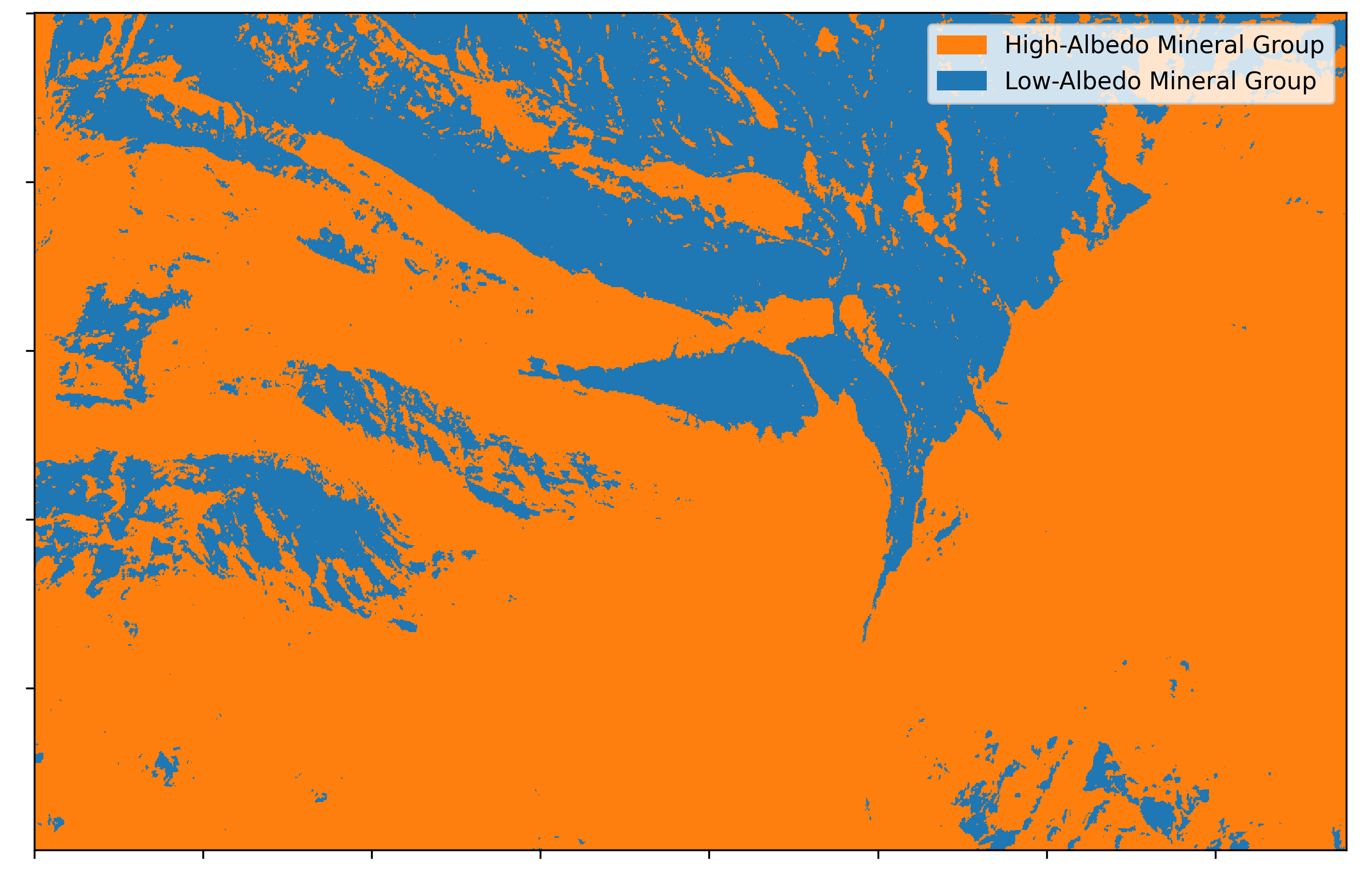
From the histogram, we can decide on a threshold to classify our pixels based on their average albedo. This is generally equivalent to classifying the image into bright-colored minerals and dark-colored minerals (albeit in the shortwave infrared range, not in the visible range). Typically, low-albedo minerals in SWIR also appear dark in visible light. Our first classification results are shown below which shows the most basic classification of the image we have: reflective vs absortive minerals.
3. PCA and K-Means Clustering
Since the number of pixels and spectral bands is often too high to handle for meaningful interpretation, dimensional reduction and data clustering methods can be useful for grouping data into clusters of spectra based on their spectral similarity which can make further analysis to be easier. While we can directly apply K-Means clustering to the data, this is not usually recommended. Each dimension of our data carries varying levels of information and noise. For high-dimensional data, only a few dimensions typically contain significant information, while others only add noise to the algorithm.
PCA is a dimensionality reduction method that organizes data based on its variability in the data space, corresponding to its information content. It identifies the directions (principal components) where the data varies the most and projects the data onto these axes in descending order of variance. The downside is that the data is transformed into an orthogonal space where the units lose their original physical meaning. In this example, we visualize the first 10 principal components and observe that by the 10th component, there is minimal discriminatory power. Therefore, we reduce the dimensionality from 55 to 10 principal components, preserving the most significant information, and use this result as the input for K-Means clustering.

The K-Means algorithm clusters data points based on their similarities. It assigns each point to one of K clusters based on its proximity to the cluster centroids, iterating to minimize variance within clusters. Similarities are computed using Euclidean distance, which I explained in a previous post.
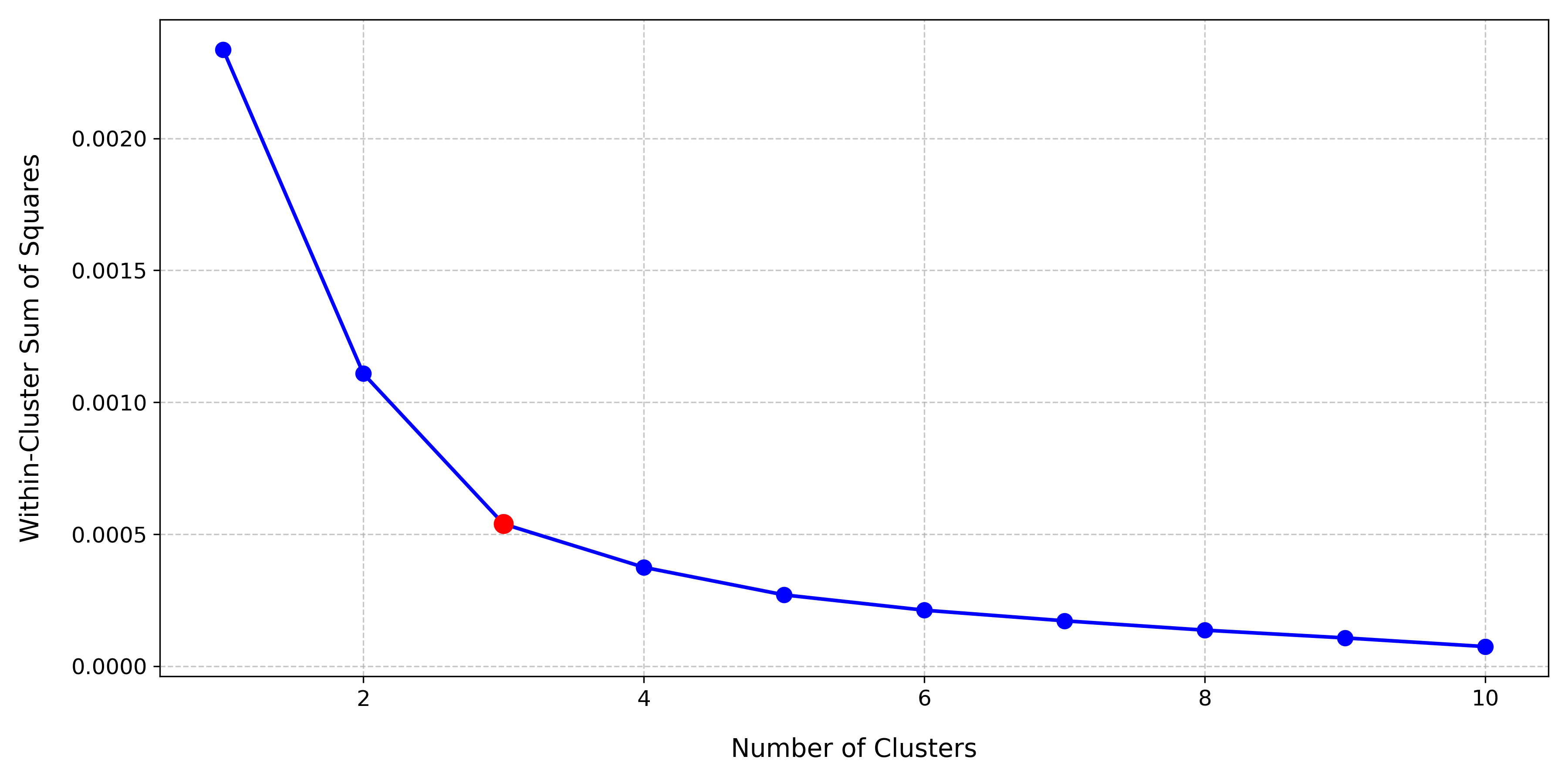
K-Means requires the user to define the number of clusters (\(K\) ). The elbow method can help determine this, by plotting the within-cluster sum of squares (WCSS) for various K values. The optimal number of clusters is where the WCSS curve starts to saturate, resembling an elbow. For this dataset, the optimal number of clusters is 3, as shown below:
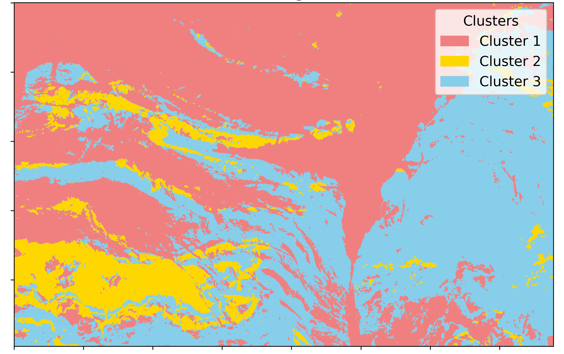
Using \(K=3\) , we perform clustering, with the results shown below:
We then can transform the pixels back from PCA space to the original data space to examine the average mean spectra of each cluster:
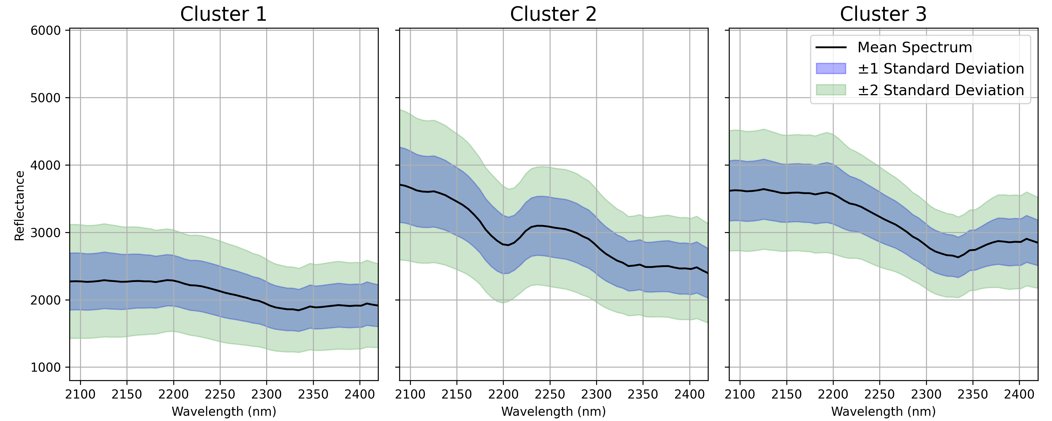
Compared to our initial simple classification by mean albedo, this approach offers more nuance. For instance, the high-albedo reflectance now separates into two distinct spectral shapes, while the low-albedo minerals remain a single cluster. To further refine the low-albedo cluster, we could mask the high-albedo pixels and repeat the process. However, for this example, I am satisfied with these results. At this stage, I observe that the low-albedo cluster has largely featureless spectra (likely consisting of minerals without distinct features in the SWIR range), making further attempt for meaningful subdivision challenging.
4. Endmember Extraction and Linear Spectreal Unmixing
Since our average spectra likely represent complex mixtures, it is useful to extract their possible pure spectral shapes. At this stage, we have decided to categorize our image into three distinct classes. We will use the N-FINDR algorithm with \(n=3\) to extract the three purest endmembers from our image. The data distribution in 2D PCA space and the extracted endmember pixels are shown below:
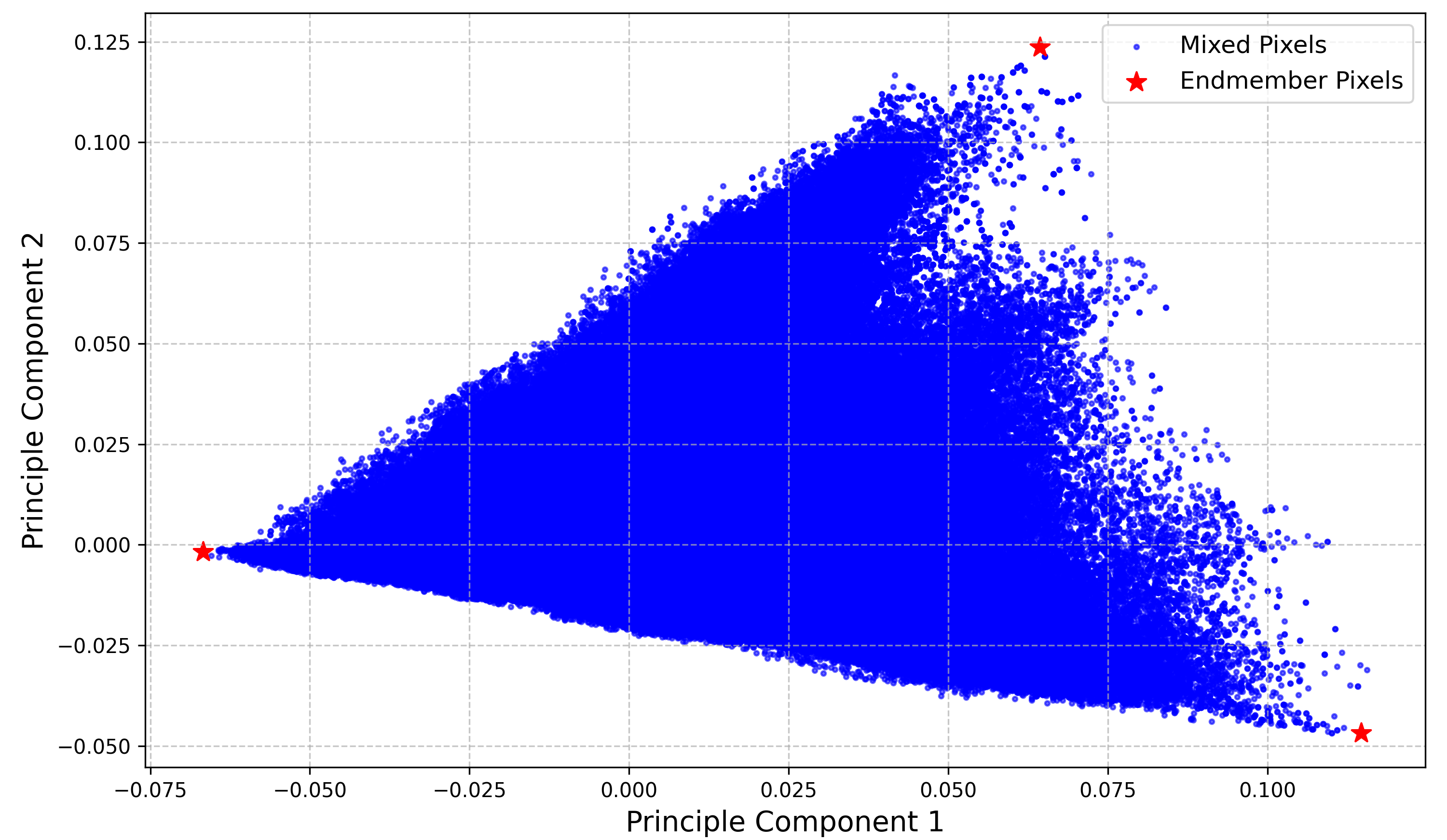
This is an excellent 2D PCA representation. The 2D simplex (triangle) is almost perfectly formed, indicating that our entire dataset can be described as a linear combination of three endmember spectra. These endmembers therefore must be the pixel that correspond to the vertices of the triangle. After transforming the extracted endmembers back into the original data space, we observe their pure spectral signatures:
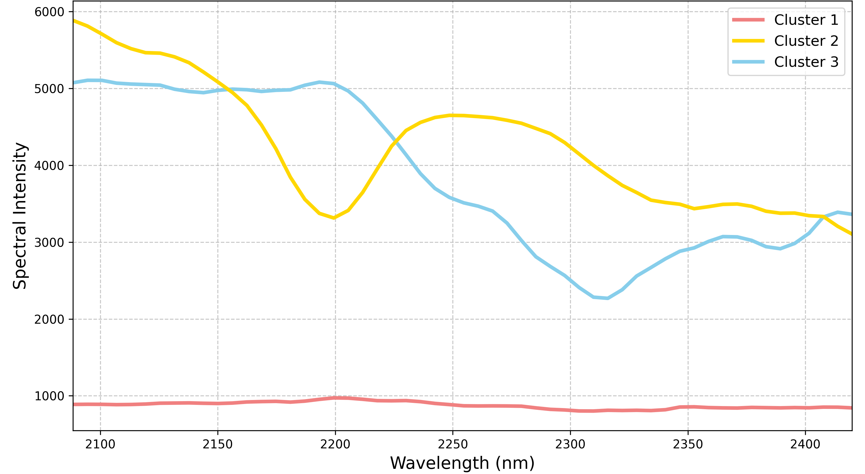
This is a good point to start naming our classes properly. You could match the spectra to a spectral library using a feature-matching algorithm to identify the mineral spectra most similar to the extracted endmembers. For simplicity, I use broad categorizations. I define the first spectrum as the Low-Albedo Mineral Group, likely dominated by plagioclase or mafic minerals, interpreted as part of a volcanic rock complex. The second spectrum corresponds to the Hydroxyl Mineral Group, based on its \(AlOH\) feature around 2200 nm, likely related to the occurance of white micas or clays, interpreted as part of siliciclastic rocks such as arkose. The third spectrum represents the Carbonate Mineral Group, with a \(CO_3\) feature near 2300 nm, likely from calcareous sedimentary rocks like limestone or calcareous sandstone/siltstone.
With our pure endmembers identified, we can perform linear spectral unmixing to estimate their relative abundances. At this stage of analysis, I prefer to not constrain the unmixing result to be strictly sum-to-one since there are still many unknowns. These abundance results are interpreted as unconstrained abundances, distinct from absolute abundances, which have more physical meaning. Below are the unconstrained abundance maps for each endmember:

Since we are dealing with only three mineral groups, we can assign each abundance to an RGB channel to produce a ternary representation of the unconstrained abundances:
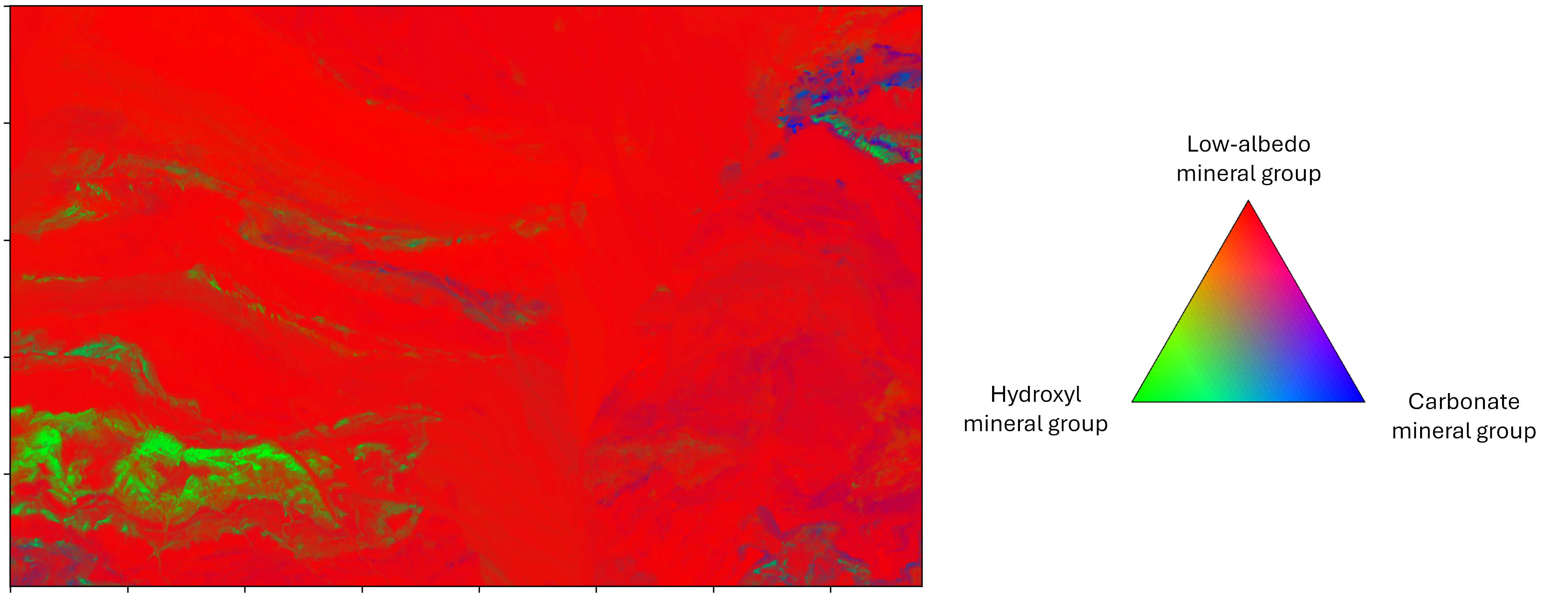
It is important to note that this ternary representation is purely for visualization and does not strictly correspond to the absolute abundance of each endmember.
5. Minimum Wavelength Mapping
Many distinct hyroxyl and carboante minerals can be distinguished based on the subtle difference in the wavelength position of their deepest absorption feature. Using a method called minimum wavelength mapping, we can detect these subtle shifts and potentially refine our classification to include specific members of the carbonate and hydroxyl mineral groups. The first step is to detect the wavelength of the deepest absorption feature across the entire spectral range.
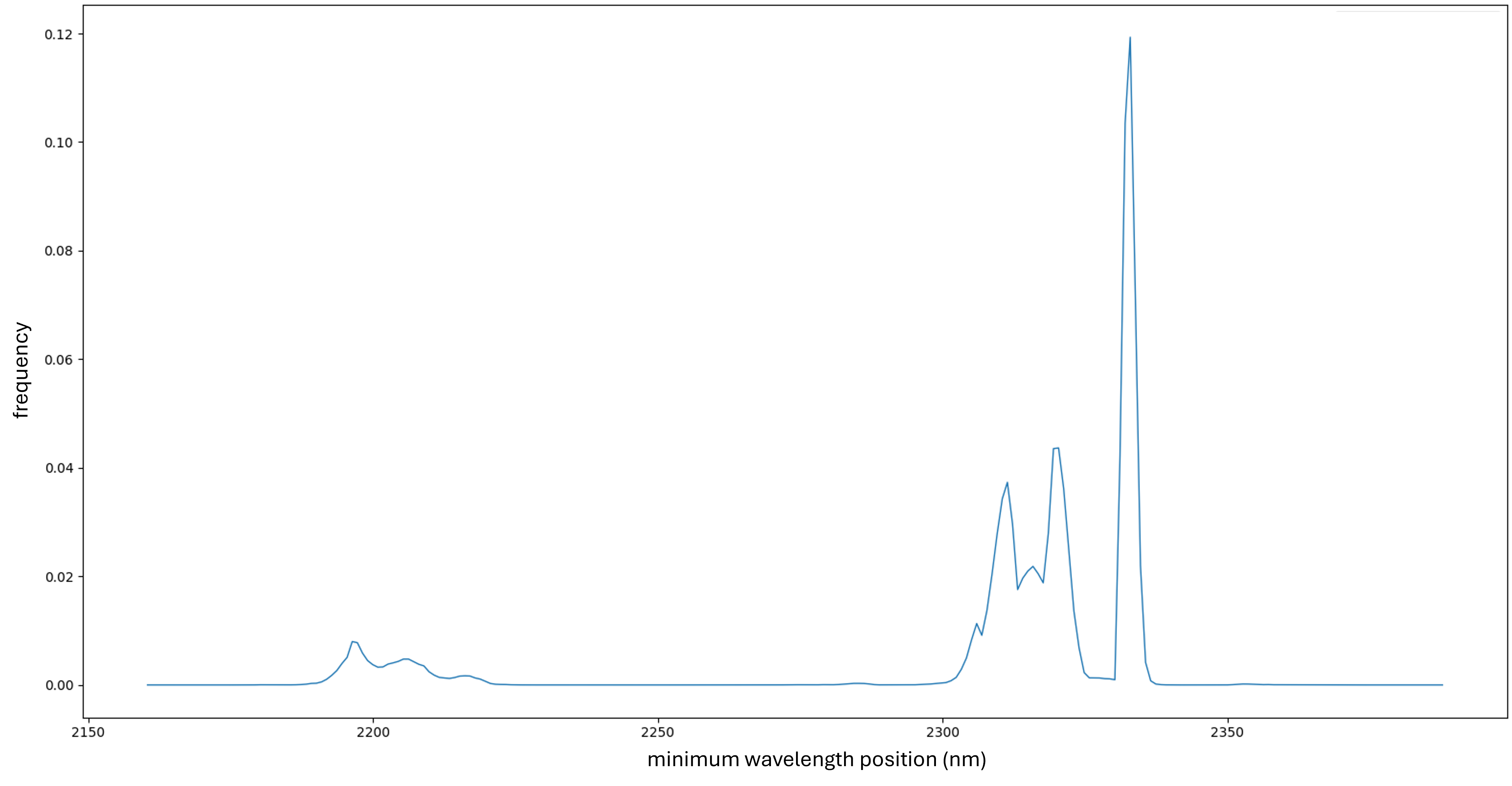
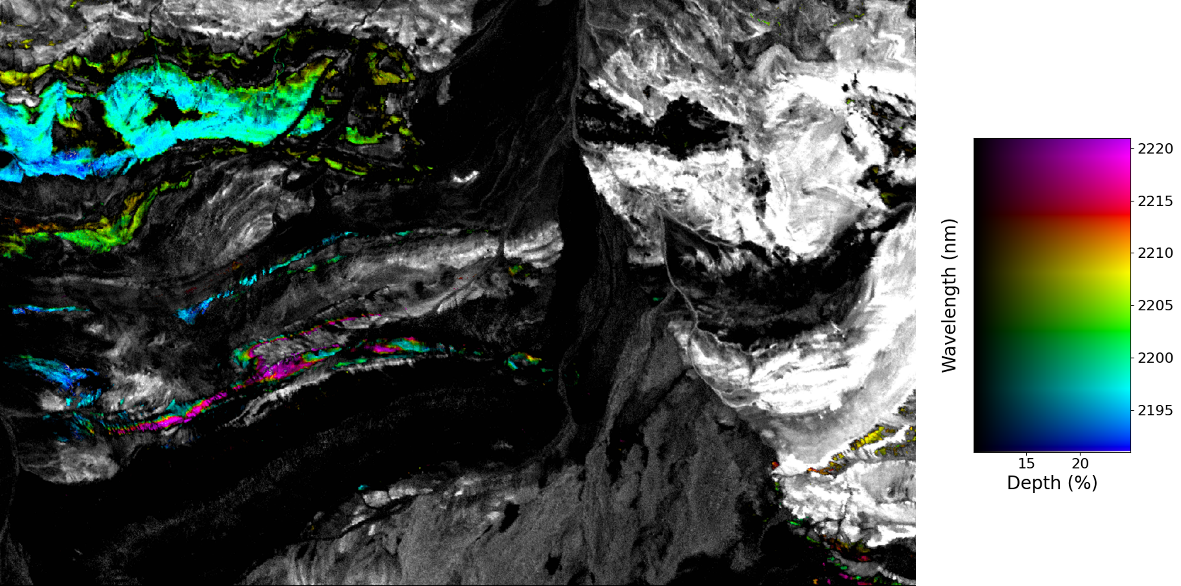
We observe at least three distinct distributions of \(AlOH\) absorption features and five distributions of \(CO_3\) absorption features. For the \(AlOH\) group, the lowest feature observed at 2195 nm likely corresponds to lithium-rich white mica, such as lepidolite. The other two \(AlOH\) features, around 2210 nm and 2220 nm, likely correspond to \(Al\)-rich white mica, such as muscovite, with minor geochemical differences attributed to variations of geochemistry and temperature of the mineral formation.
For the \(CO_3\) group, there is significant variation in the deepest feature wavelengths. Although identifying specific minerals at this stage is challenging, the observed ranges suggest these features are unlikely to correspond to calcite, the most common carbonate mineral. For instance, features around 2335 nm are commonly associated with siderite, 2320 nm with dolomite, and 2305 nm with magnesite.
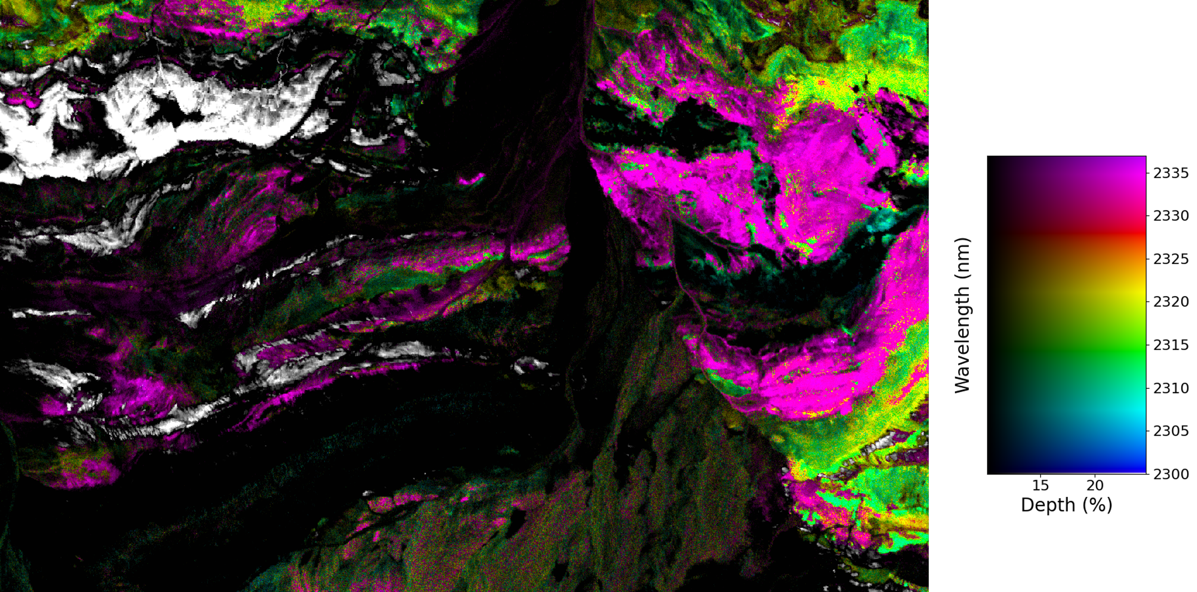
It is essential to note that pinpointing specific minerals requires further analysis. While we cannot yet confirm the mineral species, the variations in these wavelength ranges are likely related to mineralogical differences. Therefore, the spatial distribution of these distinct groups remains valid, even when we are still uncertain with the definitive mineral identifications.
6. Further comments
In this post, I demonstrated some typical EDA steps for hyperspectral analysis for geological investigations in an unfamiliar region. These EDA steps serve to familiarize us with the data and provide a solid foundation for further investigation.
Here we see that SWIR hyperspectral data alone can reveal a wealth of information, even without incorporating additional datasets, prior knowledge of the region, or advanced analysis techniques. However, complementary datasets, such as VNIR and LWIR spectral data, could significantly enhance geological and mineralogical interpretation of the region. Additionally, methods beyond infrared spectrometry, such as gamma-ray spectrometry, offer valuable tools for geological mapping.
In practice, prior knowledge of the study area—such as geological maps or models—is often available and can effectively guide the analysis. More importantly, incorporating fieldwork data, even from sparse sampling points, is crucial for validating and refining the results.
Enjoy Reading This Article?
Here are some more articles you might like to read next: