Quick Soil Sampling Data Summary With Python
Geologists often use soil sampling methods in mineral exploration to gather information about element anomalies in the soil of a certain area. The output of this activity is a database containing coordinates and various element concentrations from the sample taken at that point. Before diving deep into the data and doing any fancy analysis, it is always a good idea to familiarize ourselves with the data by looking into the summary statistics and the general and spatial relationship of the data as a whole. By using Python we can write a simple code to get the summary statistics and some useful graphs to summarize the data in just a few minutes.
We will use pandas, numpy, and matplotib libraries for this code, so let’s begin with importing our library
import pandas as pd
import numpy as np
import matplotlib.pyplot as plt
We can use pandas to read our dataset and put it into a variable called data. We can then use head() function from pandas to look at the first 5 rows of the data.
data = pd.read_csv('soil_data_example.csv')
data.head()
| EASTING | NORTHING | Mg | Al | Si | P | S | Cl | Ca | Ti | ... | Cd | Sn | Sb | W | Hg | Pb | Bi | Th | U | LE | |
|---|---|---|---|---|---|---|---|---|---|---|---|---|---|---|---|---|---|---|---|---|---|
| 0 | 803041 | 9880671 | 0.0 | 0.0 | 53.495 | 86.0 | 686.0 | 149 | 405.0 | 6.244 | ... | 0 | 35 | 0 | 0 | 0 | 31.0 | 0 | 39 | 0 | 844.453 |
| 1 | 803137 | 9880700 | 0.0 | 0.0 | 53.272 | 84.0 | 660.0 | 0 | 461.0 | 5.452 | ... | 0 | 0 | 0 | 0 | 0 | 66.0 | 0 | 41 | 4 | 813.117 |
| 2 | 803055 | 9880624 | 0.0 | 0.0 | 57.548 | 154.0 | 621.0 | 0 | 203.0 | 6.865 | ... | 0 | 95 | 0 | 0 | 0 | 41.0 | 0 | 37 | 0 | 831.336 |
| 3 | 803150 | 9880652 | 0.0 | 0.0 | 68.581 | 101.0 | 684.0 | 0 | 325.0 | 6.396 | ... | 0 | 45 | 0 | 0 | 0 | 58.0 | 0 | 38 | 0 | 834.693 |
| 4 | 803070 | 9880576 | 0.0 | 0.0 | 73.638 | 184.0 | 758.0 | 0 | 251.0 | 7.636 | ... | 26 | 126 | 0 | 0 | 0 | 68.0 | 0 | 31 | 0 | 819.252 |
5 rows × 37 columns
Note: for this example, we use data with dummy coordinates.
Summary statistics
By using pandas, getting summary statistics is as simple as this:
pd.set_option('display.max_columns', None)
data.iloc[:,2:].describe()
| Mg | Al | Si | P | S | Cl | Ca | Ti | V | Cr | Mn | Fe | Co | Ni | Cu | Zn | As | Se | Rb | Sr | Y | Zr | Nb | Mo | Ag | Cd | Sn | Sb | W | Hg | Pb | Bi | Th | U | LE | |
|---|---|---|---|---|---|---|---|---|---|---|---|---|---|---|---|---|---|---|---|---|---|---|---|---|---|---|---|---|---|---|---|---|---|---|---|
| count | 483.000000 | 483.000000 | 483.000000 | 483.000000 | 483.000000 | 483.000000 | 483.000000 | 483.000000 | 483.000000 | 483.000000 | 483.000000 | 483.000000 | 483.000000 | 483.000000 | 483.000000 | 483.000000 | 483.000000 | 483.000000 | 483.000000 | 483.000000 | 483.000000 | 483.000000 | 483.000000 | 483.000000 | 483.000000 | 483.000000 | 483.000000 | 483.000000 | 483.000000 | 483.000000 | 483.000000 | 483.000000 | 483.000000 | 483.000000 | 483.000000 |
| mean | 0.361609 | 37.306886 | 79.901859 | 164.188741 | 635.832406 | 108.314700 | 447.012607 | 4.826319 | 35.511387 | 67.778468 | 75.228035 | 65.516644 | 256.832961 | 14.291925 | 22.339545 | 50.455487 | 43.819876 | 1.204969 | 90.469979 | 19.761905 | 30.440994 | 322.449275 | 25.619048 | 1.917184 | 90.842650 | 5.383023 | 14.844720 | 5.236025 | 0.409938 | 0.300207 | 49.049996 | 0.267081 | 31.828157 | 0.389234 | 799.849393 |
| std | 2.524420 | 19.170464 | 21.018874 | 105.011094 | 116.399578 | 166.519336 | 364.993895 | 1.125096 | 27.704977 | 72.420758 | 132.400090 | 48.937698 | 266.687782 | 16.964439 | 21.153868 | 42.358326 | 47.032683 | 1.866225 | 53.418809 | 14.534807 | 7.541458 | 108.510507 | 6.765470 | 5.917603 | 78.306505 | 10.428192 | 67.141786 | 22.061828 | 2.077758 | 1.339993 | 89.163245 | 2.859267 | 13.579391 | 1.446719 | 40.073827 |
| min | 0.000000 | 0.000000 | 38.589000 | 0.000000 | 1.004000 | 0.000000 | 1.000000 | 2.137000 | 0.000000 | 0.000000 | 0.000000 | 4.597000 | 0.000000 | 0.000000 | 0.000000 | 7.000000 | 0.000000 | 0.000000 | 11.000000 | 7.000000 | 13.000000 | 104.000000 | 9.000000 | 0.000000 | 0.000000 | 0.000000 | 0.000000 | 0.000000 | 0.000000 | 0.000000 | 0.000000 | 0.000000 | 0.000000 | 0.000000 | 631.444000 |
| 25% | 0.000000 | 40.015500 | 63.242000 | 96.500000 | 565.500000 | 0.000000 | 1.376500 | 3.935000 | 19.000000 | 0.000000 | 0.000000 | 24.906500 | 0.000000 | 0.000000 | 8.000000 | 22.000000 | 16.000000 | 0.000000 | 50.500000 | 12.000000 | 26.000000 | 247.500000 | 21.000000 | 0.000000 | 27.000000 | 0.000000 | 0.000000 | 0.000000 | 0.000000 | 0.000000 | 21.000000 | 0.000000 | 22.000000 | 0.000000 | 776.857500 |
| 50% | 0.000000 | 44.624000 | 77.059000 | 154.000000 | 637.000000 | 0.000000 | 536.000000 | 4.613000 | 37.000000 | 42.000000 | 32.000000 | 47.867000 | 159.000000 | 12.000000 | 18.000000 | 37.000000 | 31.000000 | 0.000000 | 76.000000 | 16.000000 | 30.000000 | 313.000000 | 25.000000 | 0.000000 | 65.000000 | 0.000000 | 0.000000 | 0.000000 | 0.000000 | 0.000000 | 28.000000 | 0.000000 | 30.000000 | 0.000000 | 811.330000 |
| 75% | 0.000000 | 48.510000 | 95.729000 | 251.000000 | 702.000000 | 191.500000 | 774.000000 | 5.567500 | 50.000000 | 108.000000 | 75.500000 | 101.228000 | 483.000000 | 22.000000 | 30.000000 | 68.000000 | 54.000000 | 2.000000 | 118.000000 | 22.000000 | 34.000000 | 385.500000 | 29.000000 | 0.000000 | 147.500000 | 0.000000 | 0.000000 | 0.000000 | 0.000000 | 0.000000 | 39.000000 | 0.000000 | 42.000000 | 0.000000 | 829.934000 |
| max | 22.825000 | 77.831000 | 150.081000 | 465.000000 | 970.000000 | 830.000000 | 999.000000 | 9.502000 | 337.000000 | 385.000000 | 896.000000 | 243.907000 | 989.000000 | 232.000000 | 145.000000 | 490.000000 | 455.000000 | 12.000000 | 309.000000 | 149.000000 | 59.000000 | 735.000000 | 45.000000 | 96.000000 | 351.000000 | 55.000000 | 827.000000 | 223.000000 | 22.000000 | 12.000000 | 867.000000 | 45.000000 | 66.000000 | 13.000000 | 865.822000 |
For practicality, pandas by default will not show the full range of rows and columns of our dataset. The first line of the code tells pandas to show the full range of the columns. In the second line, we use iloc[:, 2:] attribute to ignore the first two columns of our dataset because we don’t need summary statistics of the x and y coordinate (unless for some reason you do).
Histograms
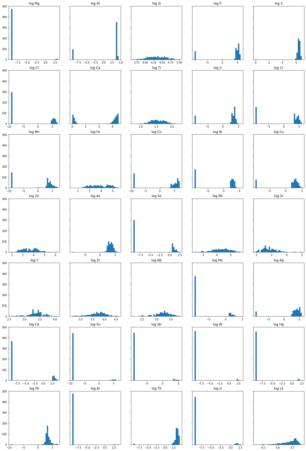
Next, we will draw the histogram of each element’s concentration in the area. Because of the logarithmic nature of element concentration in the soil, we will plot the log concentration value into the histogram. Since we are dealing with a lot of 0’s, we will add a very small value to all the concentration data to make it easier with the logarithmic transformation. There are various ways to deal with zero values in the dataset, but for this example, let’s just add 0.0001 to all concentration data.
data.iloc[:,2:] = np.log(data.iloc[:,2:]+0.0001)
np.log is a natural logarithm with base e if we want logarithm transformation with base 10 we can use np.log10. Now if we call data.head() we will see that that the concentration of each element already transformed into its logarithmic value.
Note: code above will return an error if there are still zero values in the datasets. There are various ways to deals with
0andNaNvalue in our dataset and it was up to you which method you will use for your case. You can also ignore this line if you don’t want to do any logarithmic transformation for your dataset
data.head()
| EASTING | NORTHING | Mg | Al | Si | P | S | Cl | Ca | Ti | V | Cr | Mn | Fe | Co | Ni | Cu | Zn | As | Se | Rb | Sr | Y | Zr | Nb | Mo | Ag | Cd | Sn | Sb | W | Hg | Pb | Bi | Th | U | LE | |
|---|---|---|---|---|---|---|---|---|---|---|---|---|---|---|---|---|---|---|---|---|---|---|---|---|---|---|---|---|---|---|---|---|---|---|---|---|---|
| 0 | 803041 | 9880671 | -9.21034 | -9.21034 | 3.979590 | 4.454348 | 6.530878 | 5.003947 | 6.003887 | 1.831637 | 3.135499 | 3.761202 | -9.210340 | 3.880823 | 4.543296 | 2.302595 | 2.302595 | 4.219509 | 4.060445 | -9.21034 | 3.044527 | 2.484915 | 3.555351 | 6.146329 | 3.367299 | -9.21034 | 3.713575 | -9.21034 | 3.555351 | -9.21034 | -9.21034 | -9.21034 | 3.433990 | -9.21034 | 3.663564 | -9.210340 | 6.738689 |
| 1 | 803137 | 9880700 | -9.21034 | -9.21034 | 3.975413 | 4.430818 | 6.492240 | -9.210340 | 6.133398 | 1.696001 | 3.295841 | 4.812185 | 6.284134 | 4.346828 | 5.752573 | 2.772595 | -9.210340 | 4.700481 | 4.709531 | -9.21034 | 3.761202 | 2.833219 | 3.663564 | 5.993962 | 3.367299 | -9.21034 | 4.174389 | -9.21034 | -9.210340 | -9.21034 | -9.21034 | -9.21034 | 4.189656 | -9.21034 | 3.713575 | 1.386319 | 6.700875 |
| 2 | 803055 | 9880624 | -9.21034 | -9.21034 | 4.052621 | 5.036953 | 6.431331 | -9.210340 | 5.313206 | 1.926451 | 2.995737 | 3.496511 | 3.465739 | 3.970464 | 5.003947 | 3.091047 | 3.091047 | 4.234108 | 4.174389 | -9.21034 | 2.772595 | 2.564957 | 3.610921 | 6.208590 | 3.496511 | -9.21034 | 3.931828 | -9.21034 | 4.553878 | -9.21034 | -9.21034 | -9.21034 | 3.713575 | -9.21034 | 3.610921 | -9.210340 | 6.723034 |
| 3 | 803150 | 9880652 | -9.21034 | -9.21034 | 4.228017 | 4.615122 | 6.527958 | -9.210340 | 5.783825 | 1.855688 | 3.178058 | -9.210340 | 3.295841 | 3.667786 | -9.210340 | 2.890377 | -9.210340 | 4.043053 | 4.143136 | -9.21034 | 3.295841 | 2.833219 | 3.610921 | 6.122493 | 3.367299 | -9.21034 | 3.555351 | -9.21034 | 3.806665 | -9.21034 | -9.21034 | -9.21034 | 4.060445 | -9.21034 | 3.637589 | -9.210340 | 6.727064 |
| 4 | 803070 | 9880576 | -9.21034 | -9.21034 | 4.299163 | 5.214936 | 6.630684 | -9.210340 | 5.525453 | 2.032887 | 3.806665 | 4.248497 | -9.210340 | 3.742731 | 4.025353 | 2.890377 | 2.197236 | 4.189656 | 3.988986 | -9.21034 | 2.890377 | 2.708057 | 3.688882 | 6.272877 | 3.555351 | -9.21034 | 4.174389 | 3.25810 | 4.836283 | -9.21034 | -9.21034 | -9.21034 | 4.219509 | -9.21034 | 3.433990 | -9.210340 | 6.708392 |
Next, we will use matplotlib to define our canvas and axes and then loop into each element in our dataset to plot each histogram.
fig, ax = plt.subplots(nrows=7, ncols=5, figsize=(20,8), sharey=True)
plt.subplots_adjust(top=3)


row = 0
col = 0
for element in data.iloc[:,2:].columns:
    x=list(data[element])
    ax[row,col].hist(x, bins=35)
    ax[row,col].set_title("log " + element)
    if col<4:
        col+=1
    else:
        col=0
        row+=1

plt.show()

The code above can be separated into two sections. The first section of the code will define the figure and axis canvas for our plot. Since we are dealing with 35 variables we will divide our subplots into 7 rows and 5 columns.
We can check the length of our variable with:
'''
it is getting annoying to keep typing data.iloc[:,2:]
to get our elements so let's just put it into a
variable called grade
'''
grade = data.iloc[:,2:]

len(grade.columns)
35
The second section of the code defines the loop behavior that will plot each histogram into predefined subplots.
Correlation Matrix
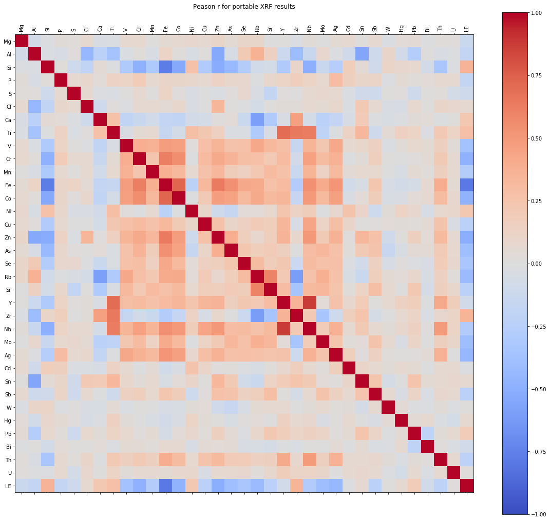
Our next figure will be a correlation matrix. This is a very useful and neat graph that will tell us the correlation coefficient of one variable with another variable within the dataset. The correlation matrix value ranges from -1 to 1, where:
- -1 = perfect negative correlation
- 0 = no correlation
- 1 = perfect positive correlation.
Pandas come in handy with its corr() function to calculate a correlation matrix of our dataset. Combine it with matplotlib functions such as: matshow() to draw the matrix into a figure; cmap() to denote it with colormap; and colorbar() to draw the legend, and we can get this informative graph.
cor_matrix = grade.corr()
fig = plt.figure(figsize=(20, 18))
ax = fig.add_subplot(111)
cax = ax.matshow(cor_matrix,cmap='coolwarm', vmin=-1, vmax=1)
ticks = np.arange(0,len(grade.columns),1)

fig.colorbar(cax)
ax.set_xticks(ticks)
plt.xticks(rotation=90)
plt.title('Correlation Matrix')
ax.set_yticks(ticks)
ax.set_xticklabels(grade.columns)
ax.set_yticklabels(grade.columns)

plt.show()

Map plots
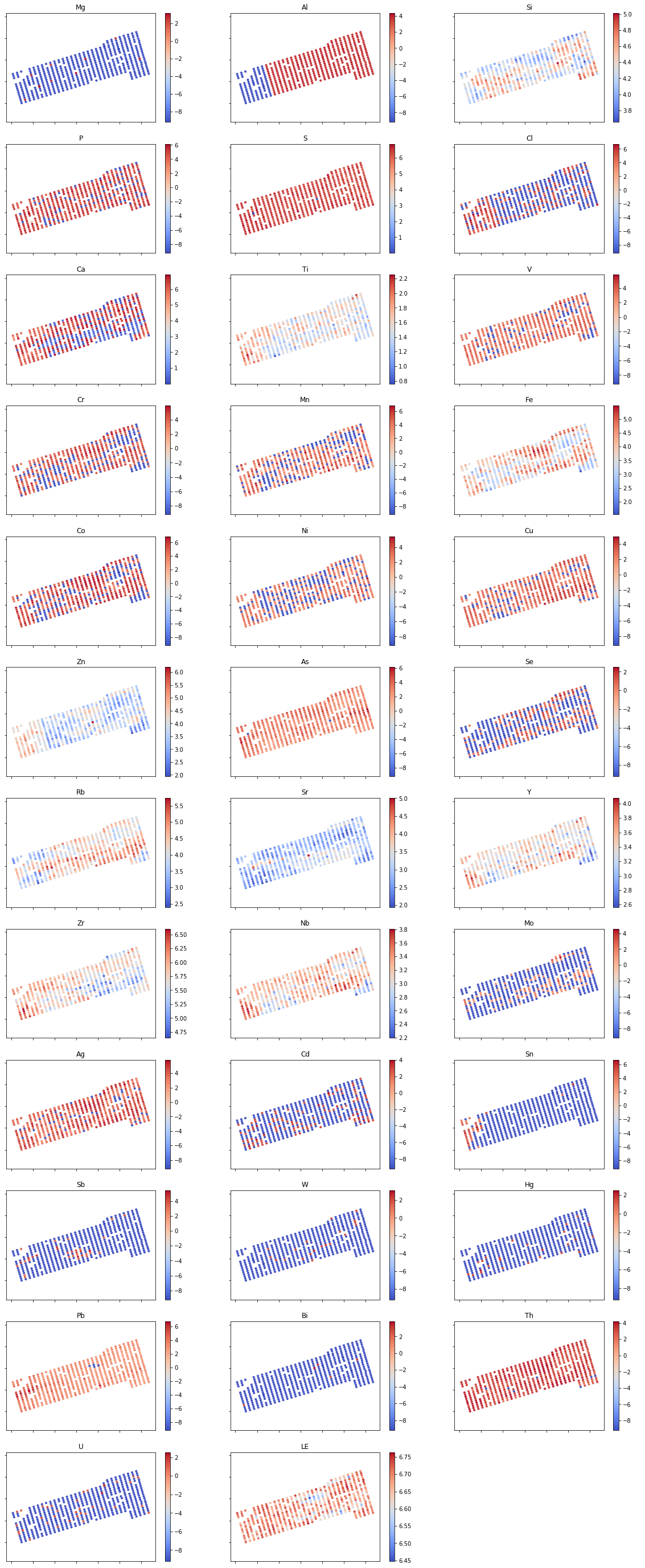
With the same concept as the histogram plot, we can make quick and dirty map plots of our points to get a glimpse of the spatial correlation of each element. For this purpose, we use scatter() function with our UTM coordinates as its x and y value and denote the concentration value of each element to a color map using cmap(). We do this using for loop so it can loop to each element in our grade data.
fig, ax = plt.subplots(figsize=(20,50), nrows=12, ncols=3)

rows=0
cols=0
for element in grade:
    cax = ax[rows,cols].scatter(data['EASTING'], data['NORTHING'], c=grade[element], cmap='coolwarm', s=10, alpha=0.9)
    ax[rows,cols].set_xticklabels('')
    ax[rows,cols].set_yticklabels('')
    ax[rows,cols].set_title(element)
    ax[rows,cols].axis('equal')
    fig.colorbar(cax, ax=ax[rows,cols])
    if cols<2:
        cols+=1
    else:
        cols = 0
        rows += 1
ax[11,2].set_axis_off()

plt.show()

And that’s it. Your soil sampling data summary in just about a minute. You can download the full code on my GitHub page and reuse it for your next project. Hope it can save you the trouble and you can be more focused on your real geologist work. Have fun exploring!
Enjoy Reading This Article?
Here are some more articles you might like to read next: