Earthquake Playthrough 01
USGS provides a very useful API to their earthquake catalog called libcomcat which I think stands for library comprehensive catalog. In this post, we will try to use libcomcat to get the earthquake dataset and make some data visualization from it. Hopefully, we can exercise a few python libraries while also learning a few interesting facts about earthquakes.
Using libcomcat to get our dataframe
According to its API Documentation we can use the search module to get a SummaryEvent objects and use get_summary_dataframe to create a pandas Dataframe of basic information from a list of SummaryEvent object which contains the following columns:
- id: Authoritative ComCat event ID.
- time: Authoritative event origin time.
- latitude: Authoritative event latitude.
- longitude: Authoritative event longitude.
- depth: Authoritative event depth.
- magnitude: Authoritative event magnitude.
from libcomcat.search import search
from libcomcat.dataframes import get_summary_data_frame
from datetime import datetime
import pandas as pd

#setting libcomcat search parameters
bounds = [104.414, 127.266, -13.017, -4.119]
stime = datetime(1940,1,1)
etime = datetime.utcnow()
minmag = 0.0
maxmag = 9.9

#download SummaryEvent objects based on our predifined search parameters
eventlist = search(starttime=stime,
                  endtime=etime,
                  minlatitude=bounds[2],
                  maxlatitude=bounds[3],
                  minlongitude=bounds[0],
                  maxlongitude=bounds[1],
                  minmagnitude=minmag,
                  maxmagnitude=maxmag)

#write summary dataframe into pandas Dataframe
df = get_summary_data_frame(eventlist)
Notes: Since we are trying to search SummaryEvent objects in a broad bounds area and wide time & magnitude range, this may take a few minutes
we can inspect the first five rows of our Dataframe using data.head()
df.head()
| Unnamed: 0 | id | time | location | latitude | longitude | depth | magnitude | alert | url | eventtype | significance | |
|---|---|---|---|---|---|---|---|---|---|---|---|---|
| 0 | 0 | iscgemsup901250 | 1940-03-21 13:52:54.000 | south of Java, Indonesia | -10.316 | 107.677 | 15.0 | 6.3 | NaN | https://www.usgs.gov/programs/earthquake-hazards/earthquakes | earthquake | 611 |
| 1 | 1 | iscgemsup899784 | 1943-04-01 14:18:17.000 | 38 km W of Labuan, Indonesia | -6.389 | 105.480 | 35.0 | 7.1 | NaN | https://www.usgs.gov/programs/earthquake-hazards/earthquakes | earthquake | 776 |
| 2 | 2 | iscgem899940 | 1943-07-23 14:53:10.000 | 87 km SW of Srandakan, Indonesia | -8.591 | 109.803 | 60.0 | 7.0 | NaN | https://www.usgs.gov/programs/earthquake-hazards/earthquakes | earthquake | 754 |
| 3 | 3 | iscgem896483 | 1949-04-23 11:15:33.000 | 95 km N of Ruteng, Indonesia | -7.763 | 120.611 | 20.0 | 6.4 | NaN | https://www.usgs.gov/programs/earthquake-hazards/earthquakes | earthquake | 630 |
| 4 | 4 | iscgem896607 | 1949-06-24 22:38:49.000 | 42 km W of Labuan, Indonesia | -6.381 | 105.449 | 60.0 | 6.3 | NaN | https://www.usgs.gov/programs/earthquake-hazards/earthquakes | earthquake | 611 |
5 rows x 12 columns
We must be cautious with the units of each variable in our data, which in this case are as follows :
- x and y coordinates in decimal degrees
- depths in kilometers below sea level
- magnitude in Moment Magnitude (Mw)
We may be familiar with the Ritcher Scale as the unit of earthquake magnitude. Since there are a few proven inaccuracies in the Ritcher Scale most seismology authorities reported their magnitude in Moment Magnitude. These two units measure earthquake magnitude in base ten logarithmic scale and the difference between the units is quite low. Consult wikipedia for more information about this.
Map plot with Basemap
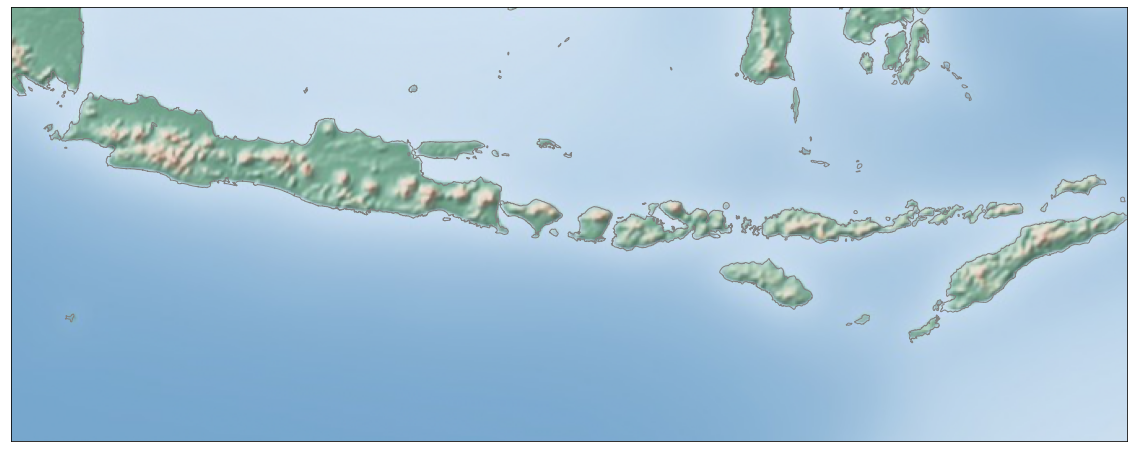
We already define our boundary area above that we use as one of the search parameters. Let’s look at the map of our area using Basemap. Since our coordinates are in decimal degrees, we will use EPSG:4326 as our projection parameters. We can look at IPSG code for other projections here.
from mpl_toolkits.basemap import Basemap
import matplotlib.pyplot as plt

#define the figure
fig = plt.figure(figsize = (20, 8))

#creating a basemap
m = Basemap(epsg = '4326',
            resolution = 'h',
            llcrnrlon = bounds[0],
            llcrnrlat = bounds[2],
            urcrnrlon = bounds[1],
            urcrnrlat = bounds[3])
m.shadedrelief()
m.drawcoastlines(color='gray')
plt.show()
We can plot our earthquake on a map using Basemap scatter with longitude and latitude as its x and y parameters. While we’re at it, let’s try to add depth and magnitude as its color and size parameters.
from mpl_toolkits.basemap import Basemap

#define the figure
fig = plt.figure(figsize = (20, 8))

#creating a basemap
m = Basemap(epsg = '4326',
            resolution = 'h',
            llcrnrlon = bounds[0],
            llcrnrlat = bounds[2],
            urcrnrlon = bounds[1],
            urcrnrlat = bounds[3])
m.shadedrelief()
m.drawcoastlines(color='gray')

#plotting the earthquakes
cax = m.scatter(df['longitude'], df['latitude'], c=df['depth'], s=(df['magnitude']**2),
          cmap='coolwarm', alpha=0.5)
fig.colorbar(cax)

plt.show()
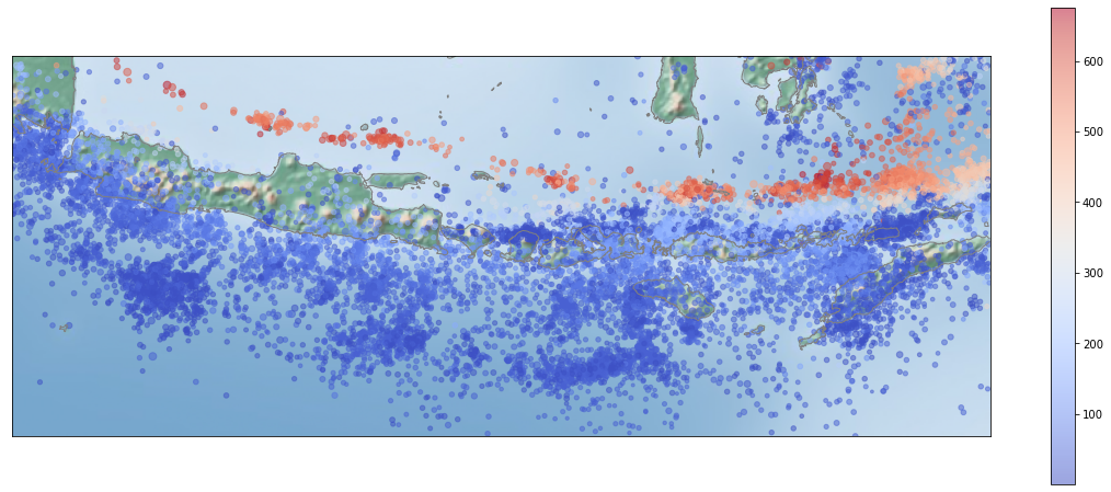
It’s interesting how the depth of the earthquake is increasing to the north. It’s most probably related to the subducted oceanic crust depth which also must be increasing to the north. A section along the latitude would show the shape of the subducted oceanic crust, we will try to make it later.
Another piece of information that we can get from the plot above is that the earthquakes are not distributed uniformly along the subduction zone. There are several areas with significantly fewer earthquake occurrences than it’s surroundings which are usually referred to as seismic gap. let’s try to make a density heatmap to get a better visualization for this. We will use np.histogram to calculate a gridded density of the earthquake and plot it with plt.pcolormash() above our Basemap.
import numpy as np

# define x,y,and z values
x=df['longitude']
y=df['latitude']
z, xedges, yedges = np.histogram2d(x, y, bins=100)

#define the figure
fig,ax = plt.subplots(figsize=(20,8))

#creating a basemap
m = Basemap(epsg = '4326',
            resolution = 'h',
            llcrnrlon = bounds[0],
            llcrnrlat = bounds[2],
            urcrnrlon = bounds[1],
            urcrnrlat = bounds[3])
m.shadedrelief()
m.drawcoastlines(color='gray')

#plot colormesh with alpha<1 for transparency
cax = plt.pcolormesh(xedges, yedges, z.T, alpha=0.4)
fig.colorbar(cax)


plt.show()
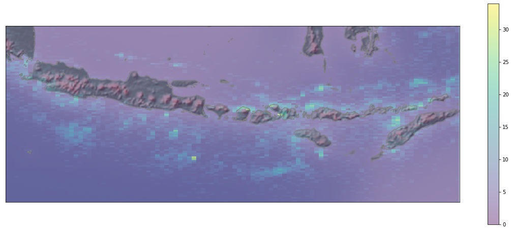
we can go one step further and use kernel density estimation to draw a smoother density heatmap by using gaussian_kde from scipy.
kernel density estimation or KDE for short is a statistical method to estimate the probability density function of a random variable based on a finite sample. Here is a very neat explanation of how KDE works on one-dimensional data.
from scipy.stats.kde import gaussian_kde

#define x,y, and z values
x=df['longitude']
y=df['latitude']
k = gaussian_kde(np.vstack([x, y]))
xi, yi = np.mgrid[x.min():x.max():x.size**0.5*1j,y.min():y.max():y.size**0.5*1j]
zi = k(np.vstack([xi.flatten(), yi.flatten()]))

#define the figure
fig,ax = plt.subplots(figsize=(20,8))

#creating a basemap
m = Basemap(epsg = '4326',
            resolution = 'h',
            llcrnrlon = bounds[0],
            llcrnrlat = bounds[2],
            urcrnrlon = bounds[1],
            urcrnrlat = bounds[3])
m.shadedrelief()
m.drawcoastlines(color='gray')

#plot colormesh with alpha<1 for transparency
cax = ax.pcolormesh(xi, yi, zi.reshape(xi.shape), alpha=0.4)
fig.colorbar(cax)


plt.show()
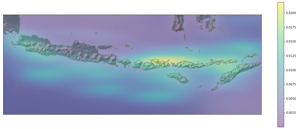
We can see from the map above that the most notable seismic gap are located at the south of Central and West Java, Bali & Lombok, and NTT.
Cross Section
Now, to see the shape of subducting slabs below Java let’s plot our earthquake datasets along the Y coordinate cross-section. To make a properly scaled cross-section first we need to transform our coordinate from latitude/longitude in decimal degrees, into UTM in the metric unit so it has the same measurement unit with the depth. Our problem is that we are dealing with a large area that spans multiple UTM zones here, and as far as I know, there is no simple and straightforward solution to this issue. Lucky for us, Google already solved this for us when they were facing the same issue for their Google Maps projects in 2005 by inventing a new projection system called Web Mercator. Let us make two new columns called ‘X_WM’ and ‘Y_WM’ for our X dan Y coordinate in Web Mercator Projection. We will use Transformer from pyproj library to calculate our coordinates transformation.
from pyproj import Transformer
transformer = Transformer.from_crs("epsg:4326", "epsg:3857", always_xy=True)
df['X_WM'], df['Y_WM'] = transformer.transform(df['longitude'].values, df['latitude'].values)
now to make our cross-section in this case we want to use ‘Y_WM’ as our X-axis in the plot, and ‘depth’ as our Y-axis. Remember that depth in our database is still in a positive kilometer so we need to transform it to a negative meter value at our plot by multiplying it by -1000.
fig,ax = plt.subplots(figsize=(20,10))
cax = ax.scatter(df['Y_WM'],
            (df['depth']*-1000),
            s=(df['magnitude']**2),
            c=(df['magnitude']),
            cmap='coolwarm',
            alpha=0.7)

ax.set(xlim=(min(df['Y_WM']), max(df['Y_WM'])), ylim=(min(df['depth']*-1000), max(df['depth']*-1000)))
fig.colorbar(cax)
plt.show()
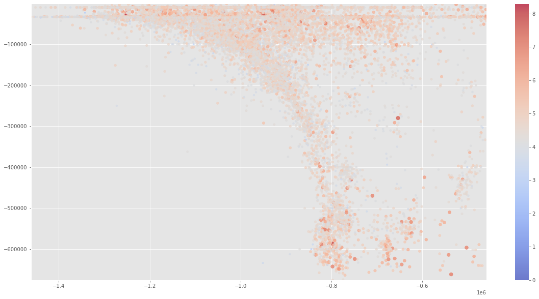
Well, yeah, It’s a subduction zone alright. I wonder what our plot would look like if we use ‘X_WM’ coordinate as our X-axis. Let’s try to make one.
fig,ax = plt.subplots(figsize=(20,10))
cax = ax.scatter(df['X_WM'],
            (df['depth']*-1000),
            s=(df['magnitude']**2),
            c=(df['magnitude']),
            cmap='coolwarm',
            alpha=0.7)

ax.set(xlim=(min(df['X_WM']), max(df['X_WM'])), ylim=(min(df['depth']*-1000), max(df['depth']*-1000)))
fig.colorbar(cax)
plt.show()
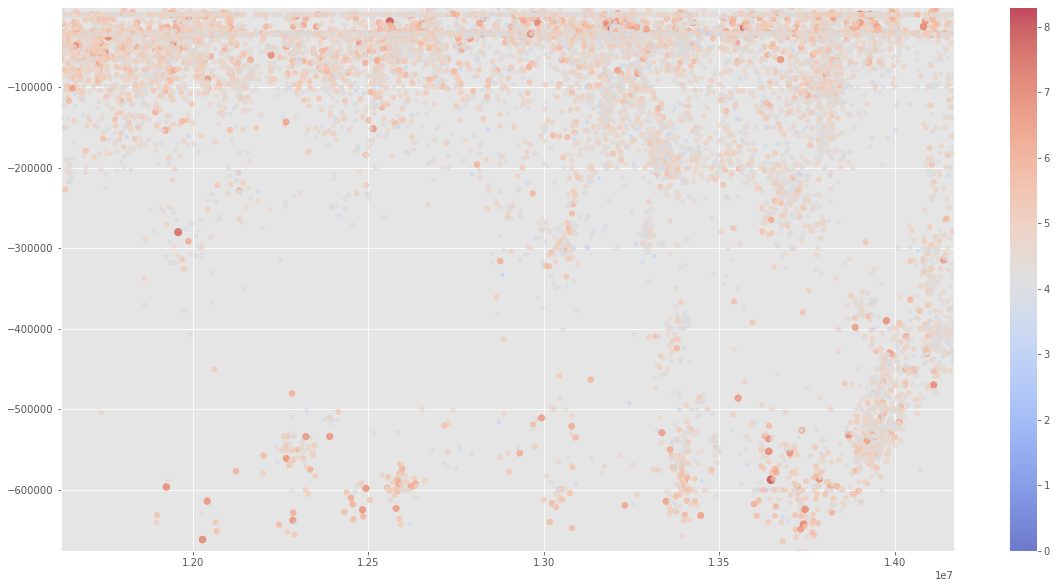
Obviously, we cannot see the shape of our subduction slab in this cross-section, but we can still get a piece of good information with this visualization. Note another seismic gap around depth 3 km to 5 km. Seismic gaps do not only occur on a horizontal plane but also on a vertical plane. We cannot see this gap clearly on our previous cross-section because our visualization is distracted by an anomaly at the eastern part of our area where apparently there is not much seismic gap there. If you look back at our map plot, you can see that this anomalous area is in the southern part of Sulawesi. Well as any Geologist knows, there are a lot of suspicious things going on in Sulawesi’s tectonic settings, so this kind of anomaly comes as no surprise.
Depth and magnitude distribution
plt.style.use('ggplot')
fig, ax = plt.subplots(ncols=2, figsize=(20,8), sharey=True)

ax[0].hist(df['depth'], bins=50)
ax[0].set_title('Depth Distribution')
ax[0].set_ylabel('freq')
ax[0].set_xlabel('km')
ax[0].text(x=0.99, y=0.99, s='min = %.2f\nmax = %.2f\nmean = %.2f\nmedian = %.2f'
           %(df['depth'].min(), df['depth'].max(), df['depth'].mean(), df['depth'].median()),
           ha='right',
           va='top',
           transform=ax[0].transAxes)
ax[1].hist(df['magnitude'], bins=30)
ax[1].set_title('Magnitude Distribution')
ax[1].set_xlabel('Mw')
ax[1].text(x=0.99, y=0.99, s=
          'min = %.2f\nmax = %.2f\nmean = %.2f\nmedian = %.2f'
           %(df['magnitude'].min(), df['magnitude'].max(), df['magnitude'].mean(), df['magnitude'].median()),
           ha='right',
           va='top',
           transform=ax[1].transAxes)

plt.show()
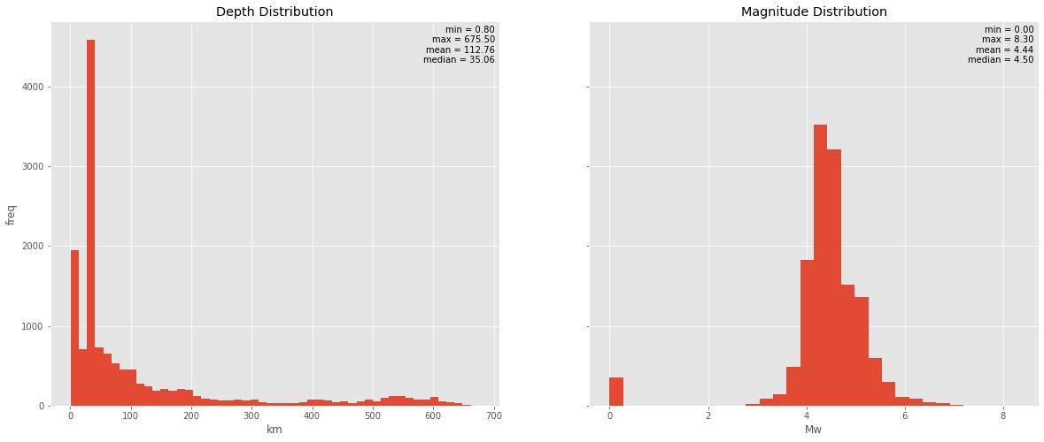
The interesting thing to notice in this depth distribution is the anomaly at the deep-focal earthquake, earthquake frequency seems to get lower with depth and reach its lowest point at around 300 km, this is expected due to the increasing plasticity of slabs with depths due to increasing pressure and temperature. What is quite unexpected is the rise of the frequency at around 500 km (it is important to note that deep-focus earthquakes are only observed around a subduction zone, so it is safe to assume that it is directly related to subduction activity). One possible explanation of the deep-focus earthquake is transformational faulting in metastable peridotite wedges within a cold slab. Where the mechanical faulting at those depths is hard to explain, some models suggest that transformational faulting due to polymorphic reactions in which olivine transforms to the spinel structure and clinoenstatite transforms to ilmenite may cause such shear instability (Kirby et al., 1996). This effect of decreasing seismic activity with depth until it reaches the depth where olivine and clinoesntatie transformation occurs where there is a little bump in the earthquake frequency caused an apparent seismic gap in the vertical plane which occurs at around 300 to 500 km.
What is surprising for me is the distribution of the magnitude which closely resembles a normal distribution with mean and median values close to each other (or we can say it a log-normal distribution since the magnitudes are in the Ritcher Scale which is a logarithmic scale) rather than resembling a power-law distribution. As for now, I can’t find any explanation for this, whether this is really the case or we actually have a problem with our datasets where USGS has difficulties in detecting the smaller magnitude earthquakes. This wikipedia page suggests the latter would be the case but also mentions some earthquake dynamics models that explain the lower frequency in lower magnitude earthquakes physically.
Now it is probably a good idea to split our dataset into several categories and see the distribution of each. Let’s split the depth into three categories based on USGS classification into:
- shallow earthquake (0-70)km
- intermediate earthquake (70-300)km
- deep earthquake(>300)km
df['depth_classification'] = df['depth'].apply(lambda x: 'shallow' if x <=70 else('deep' if x >300 else 'intermediate'))
In the line above we will use apply() and lambda to make a new column called 'depth_classification' in df Dataframe and put values on it based on the condition in column depth.
Since we need to draw a lot of histograms for depth and magnitude distribution in every classification, let’s write a function to draw it more efficiently
def classification_histogram(class_list, classification_type, nrows, ncols):
    fig, ax = plt.subplots(nrows=nrows, ncols=ncols, figsize=(20,8))
    row=0
    for nclass in class_list:
        string = str(nclass[classification_type+'_classification'].unique())[2:-2]
        ax[0,row].hist(nclass['depth'])
        ax[0,row].set_title(string +' earthquake depth distribution', fontsize=12)
        ax[0,row].text(x=0.99, y=0.99, s='min = %.2f\nmax = %.2f\nmean = %.2f\nmedian = %.2f\ncount =%i'
                   %(nclass['depth'].min(), nclass['depth'].max(), nclass['depth'].mean(),
                     nclass['depth'].median(), nclass['depth'].count()),
                   ha='right',
                   fontsize=9,
                   va='top',
                   transform=ax[0,row].transAxes)
        ax[1,row].hist(nclass['magnitude'])
        ax[1,row].set_title(string +' earthquake magnitude distribution', fontsize=12)
        ax[1,row].text(x=0.99, y=0.99, s='min = %.2f\nmax = %.2f\nmean = %.2f\nmedian = %.2f\ncount =%i'
                   %(nclass['magnitude'].min(), nclass['magnitude'].max(), nclass['magnitude'].mean(),
                     nclass['magnitude'].median(), nclass['magnitude'].count()),
                   ha='right',
                   va='top',
                   fontsize=9,
                   transform=ax[1,row].transAxes)
        row+=1
    plt.tight_layout()
the function above is pretty simple and straightforward, the inline string syntax is not the most pleasant syntax to read, but it is pretty efficient.
depth_class_list=[df[df['depth_classification']=='shallow'],
                  df[df['depth_classification']=='intermediate'],
                  df[df['depth_classification']=='deep']]
classification_histogram(depth_class_list,'depth',2 ,3)
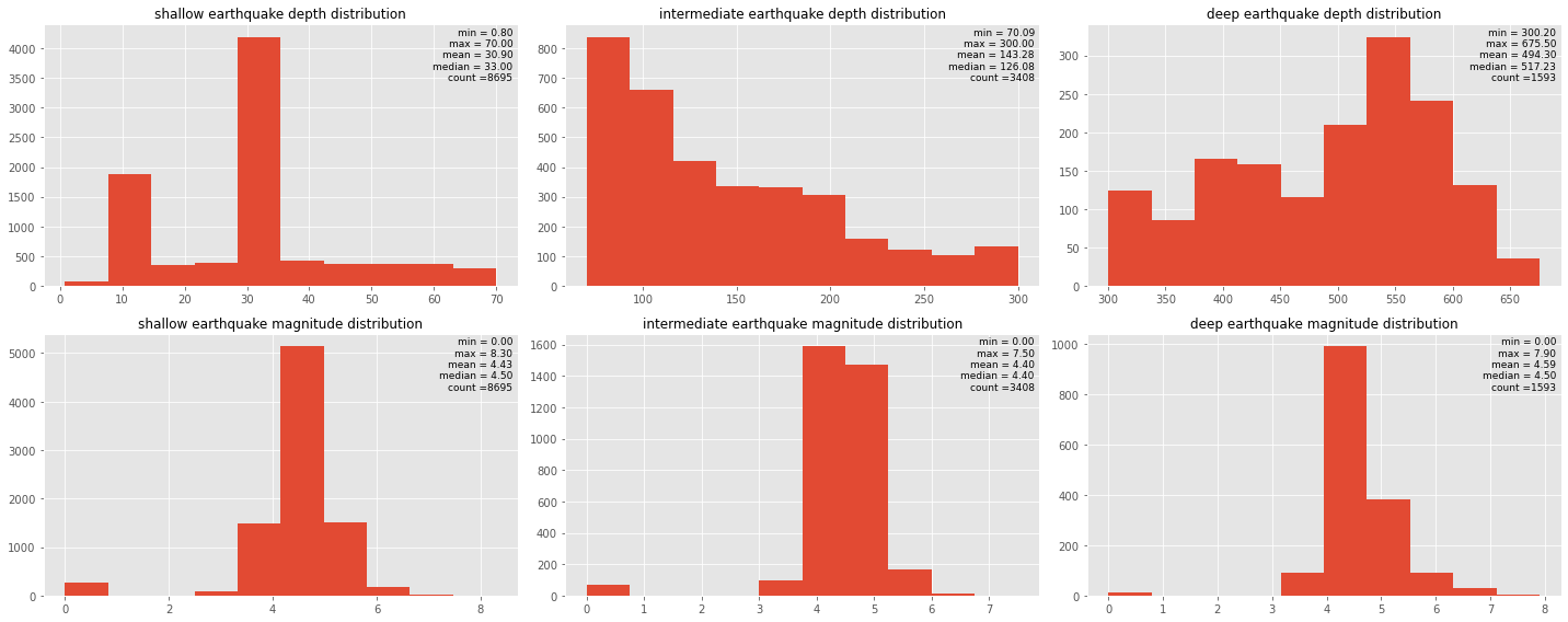
At this stage, I think the normality assumption is reasonable and it could be the basis to split our depth dataset into several groups in our classification. If we look at depth distribution in our present classification, there are still indications of mixing population since we still don’t have an unimodal distribution. I think it is a good idea to try multiple Gaussian fixes in the data in the future, for now, we will settle with this USGS classification.
I still don’t think it is a good idea to assume normality in magnitude distribution since I assume that smaller magnitude earthquake occurrences are exponentially higher than larger magnitude occurrences. But since our initial dataset distribution for magnitude shows a normal behavior, I imagine our classification should preserve the shape of the original data (which is the case for this classification), since I assume that earthquake magnitude spreads with the same behavior in all depths. Well, let’s try to split our magnitude to see if that assumption holds!
We will divide our magnitude data into several groups based on this classification into:
- minor earthquake (<4)Mw
- light earthquake (4-5)Mw
- moderate earthquake (5-6)Mw
- strong earthquake (6-7)Mw
- great earthquake (>7)Mw
df['magnitude_classification'] = df['magnitude'].apply(lambda x: 'minor' if x <= 4 else(
                                                        'light' if (x>4)&(x<=5) else (
                                                        'moderate' if (x>5)&(x<=6) else(
                                                        'strong' if (x>6)&(x<=7) else 'great'))))
magnitude_class_list=[df[df['magnitude_classification']=='minor'],
                     df[df['magnitude_classification']=='light'],
                     df[df['magnitude_classification']=='moderate'],
                     df[df['magnitude_classification']=='strong'],
                     df[df['magnitude_classification']=='great']]
classification_histogram(magnitude_class_list,'magnitude',2 ,5)
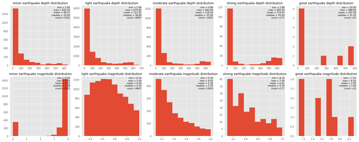
We can see from the depth histograms that every magnitude group has the same depth distribution pattern which means that our assumption still holds. From the magnitude histograms on the second row, at minor earthquake magnitude distribution, we can see that data are absent at a magnitude around 1 and 2. That is very suspicious and most probably due to incomplete data records. That is probably the reason why we have an unexpected normal distribution of our magnitude data. we can see from another group from light to great earthquake magnitude distribution that the distribution more resembles a power-law distribution. The apparent normal-like distribution that we see from our initial data is most probably due to missing a big chunk of data on the left side of our distribution.
I think that is probably all for our today’s playthrough with USGS earthquake data catalog. I believe it is a nice way to exercise Python libraries while acquiring a nice insight into the nature of earthquakes. There is so much that we can still do to our data, a few ideas that I will try for the next few weeks are trying to split our dataset into more detailed categories with multiple Gaussian fit, and calculating energy release in spatial and temporal perspective. And I am pretty sure that there is still so much to explore along the way. I’ll make sure to post my notebook update next week!
Enjoy Reading This Article?
Here are some more articles you might like to read next: